Statistics, Science, Random Ramblings
A blog about data and other interesting things
Analysing data on suicide
This analysis is on suicide rates from 1985 to 2016 in a set of about 100 countries with additional information on age, gender and economic status of that country. The data is available from Kaggle.
This post here is a slightly shortened version of the full analysis that can be found in the repository on Gitlab.
The data
Data cleaning and augmentation
library("dplyr")
library("ggplot2")
suicide <- readRDS("suicide.Rds")
As always some data cleaning and supplementing was undertaken before beginning to analyse data. Data cleaning was however minor and included:
- Cleaning of column names.
- Removal of the HDI (human development index) column as it was mostly missing.
- Removal of data from countries where the amount of data points was less than half of the possible amount of data points for a country.
- Removal of the year 2016 from the data. It was the latest data available and was only present for a few countries, making the data noisy.
- Addition of information on the continent a country belongs to.
The final data looks like this:
suicide## # A tibble: 25,752 x 12
## country year sex age suicides_no population suicides_100k_p…
## <chr> <dbl> <chr> <chr> <dbl> <dbl> <dbl>
## 1 Albania 1987 male 15-2… 21 312900 6.71
## 2 Albania 1987 male 35-5… 16 308000 5.19
## 3 Albania 1987 fema… 15-2… 14 289700 4.83
## 4 Albania 1987 male 75+ … 1 21800 4.59
## 5 Albania 1987 male 25-3… 9 274300 3.28
## 6 Albania 1987 fema… 75+ … 1 35600 2.81
## 7 Albania 1987 fema… 35-5… 6 278800 2.15
## 8 Albania 1987 fema… 25-3… 4 257200 1.56
## 9 Albania 1987 male 55-7… 1 137500 0.73
## 10 Albania 1987 fema… 5-14… 0 311000 0
## # … with 25,742 more rows, and 5 more variables: country_year <chr>,
## # gdp_for_year <dbl>, gdp_per_capita <dbl>, generation <chr>,
## # continent <chr>Map of countries with available data
First, let’s see for which countries data is available.
data_countries <- suicide %>%
  select(country) %>%
  distinct() %>%
  mutate(country = countrycode::countrycode(
    country, origin = "country.name", destination = "iso.name.en")) %>%
  tibble::deframe()

world_map <- rnaturalearth::ne_countries(returnclass = "sf") %>%
  select(admin, geometry) %>%
  mutate(admin_iso = countrycode::countrycode(
    admin, origin = "country.name", destination = "iso.name.en")) %>%
  # kosovo turns NA (likely as it is not universally recognised as independent)
  mutate(admin_iso = tidyr::replace_na(admin_iso, "Kosovo")) %>%
  mutate(in_data = ifelse(admin_iso %in% data_countries,
                          "available", "not available"))

ggplot(world_map) +
  aes(fill = in_data) +
  geom_sf(colour = "black", size = .1) +
  scale_fill_manual(values = c("available" = "maroon4",
                               "not available" = "white")) +
  coord_sf(datum = NA) +
  theme_minimal() +
  theme(legend.position = "bottom") +
  labs(title = "Countries with available data", fill = "")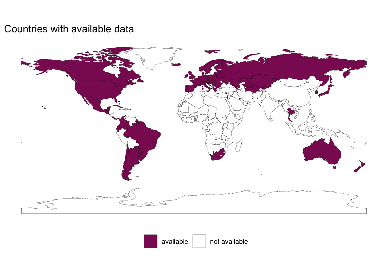
The map clearly shows that for many countries of Africa and Asia no data is available. Consequently, the analysis below is not able to identify truly global patterns and caution is advised in generalising the findings too much.
Suicide rates: trends and patterns
Development over time
It makes sense to start with the simplest way of looking at the data first: globally over time.
by_year <- suicide %>%
  group_by(year) %>%
  summarise(mean = mean(suicides_100k_pop),
            se = sd(suicides_100k_pop) / sqrt(n()))

plot_breaks <- seq(min(by_year$year), max(by_year$year), 3)

ggplot(by_year) +
  aes(x = year, y = mean, ymin = mean - se, ymax = mean + se) +
  geom_ribbon(alpha = .1) +
  geom_line() +
  geom_point() +
  expand_limits(y = 0) +
  labs(x = "Year", y = "Suicides per 100,000 people",
       title = "Global average suicide rate",
       subtitle = "The shaded area shows the standard error") +
  scale_x_continuous(breaks = plot_breaks) +
theme_minimal() 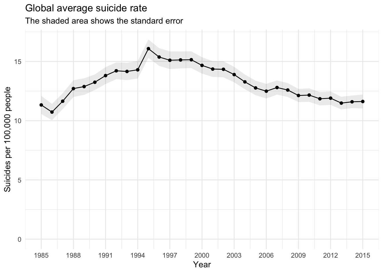
From this plot it seems like there is no overall trend in global suicide rates in the time frame available in the data. But we should take a closer look at the data.
Countries with the highest rates
Let’s identify the countries which have the highest suicide rates in any of the years available in the data.
highest_rate_year <- suicide %>%
  group_by(year, country) %>%
  summarise(mean_100k = mean(suicides_100k_pop)) %>%
  slice(which.max(mean_100k))

ggplot(highest_rate_year) +
  aes(x = year, y = mean_100k, fill = country, label = country) +
  geom_bar(stat = "identity") +
  geom_text(size = 2.5, angle = 90, aes(y = 10), hjust = 0) +
  guides(fill = FALSE) +
  scale_x_continuous(breaks = c(
      min(highest_rate_year$year, na.rm = TRUE):
      max(highest_rate_year$year, na.rm = TRUE))) +
  labs(title = "Countries with highest suicide rate",
       y = "Suicides per 100,000 people",
       x = "Year") +
  theme_minimal() +
  theme(axis.text.x = element_text(angle = 90, hjust = 1))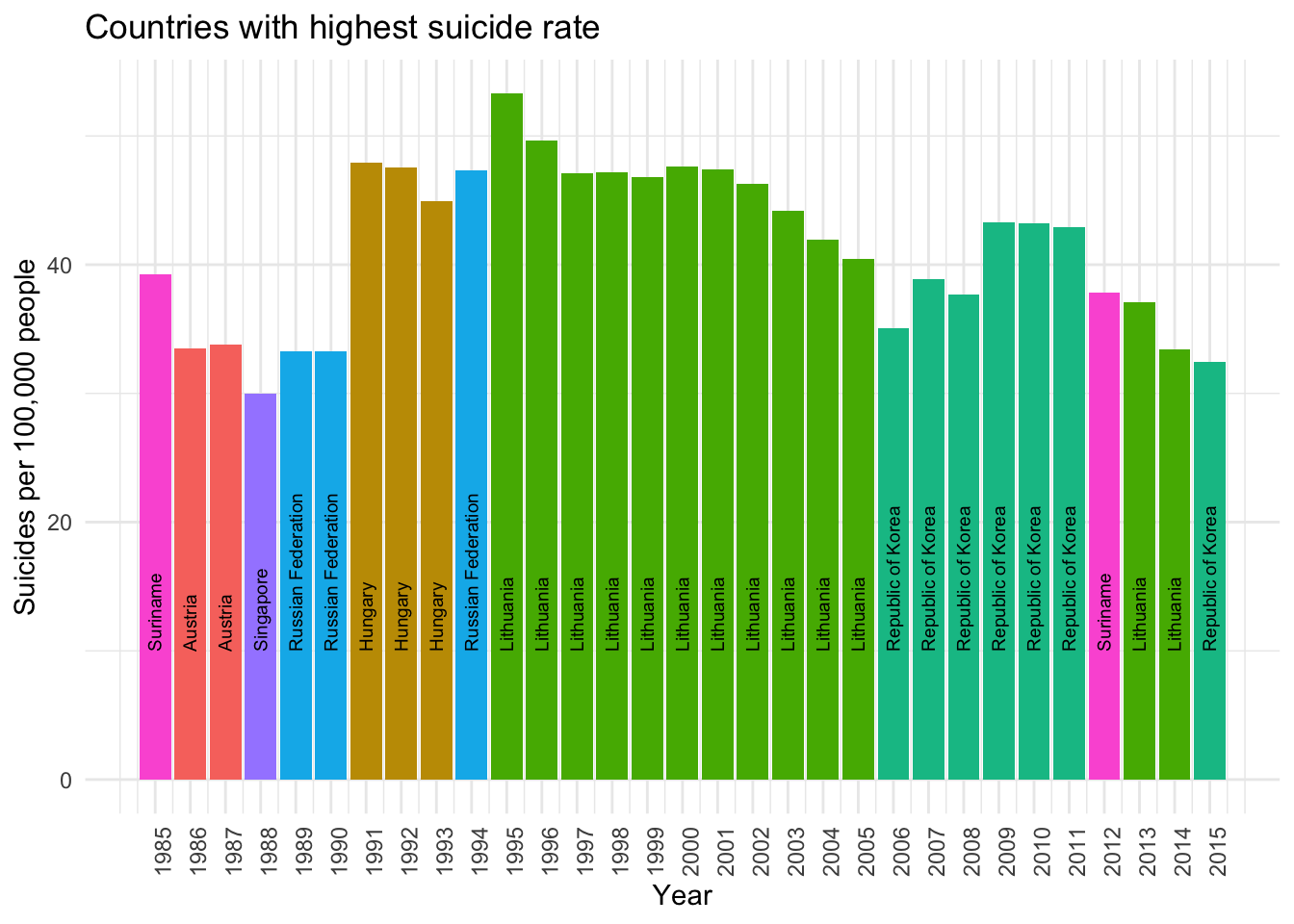
It appears like Lithuania and South Korea are the two countries that tend to have the highest suicides rates for the countries available in the data.
And it is probably interesting to have a look at how the countries in this subset of the data develop over time in the available time frame:
highest_rates <- suicide %>%
  filter(country %in% highest_rate_year$country) %>%
  group_by(country, year) %>%
  summarise(mean = mean(suicides_100k_pop))

ggplot(highest_rates) +
  aes(x = year, y = mean, colour = country) +
  geom_line() +
  geom_smooth(alpha = .2) +
  geom_point() +
  expand_limits(y = 0) +
  scale_x_continuous(breaks = plot_breaks) +
  labs(x = "Year", y = "Suicides per 100,000 people",
       colour = "Country",
       title = "Suicides in countries with highest rates") +
  theme_minimal() +
  theme(legend.position = "bottom")
## `geom_smooth()` using method = 'loess' and formula 'y ~ x'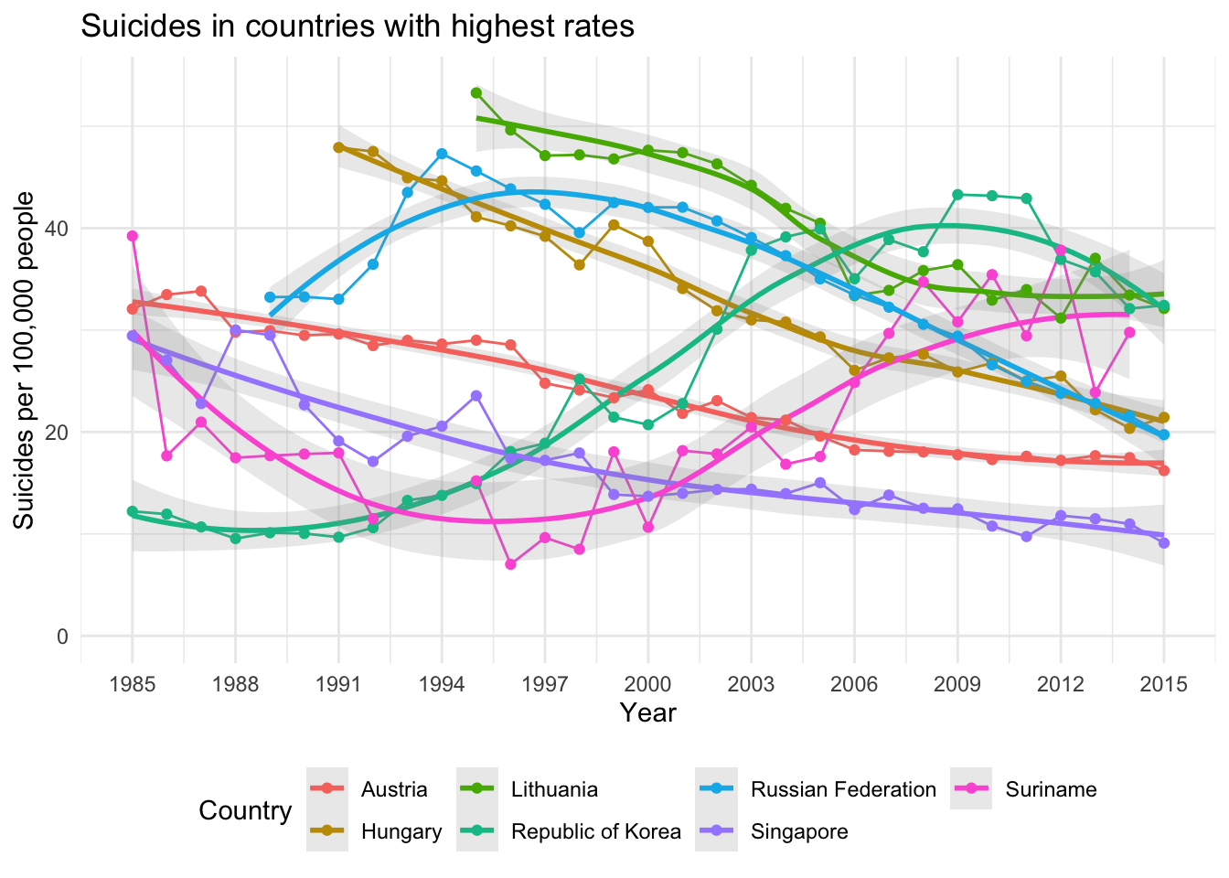
In this plot we can see that suicide rates in South Korea and Suriname increase a lot after the year 2000, although there is a slight trend in the opposite direction again for South Korea after 2010. Data for Hungary and Lithuania is not available for the entire time frame and rates in both countries start very high.
Gender differences
Given everything we know about suicides one would expect that the rates are much higher in men than in women.
by_year_and_gender <- suicide %>%
    group_by(year, sex) %>%
    summarise(mean = mean(suicides_100k_pop),
              se = sd(suicides_100k_pop) / sqrt(n()))

ggplot(by_year_and_gender) +
  aes(x = year, y = mean, group = sex, colour = sex, fill = sex,
      ymin = mean - se, ymax = mean + se) +
  geom_ribbon(alpha = .2, colour = NA) +
  geom_line() +
  geom_point() +
  expand_limits(y = 0) +
  scale_x_continuous(breaks = plot_breaks) +
  labs(x = "Year", y = "Suicides per 100,000 people",
       colour = "Gender", fill = "Gender", title = "Suicides by gender",
       subtitle = "The shaded area shows the standard error") +
  theme_minimal() +
  theme(legend.position = "bottom")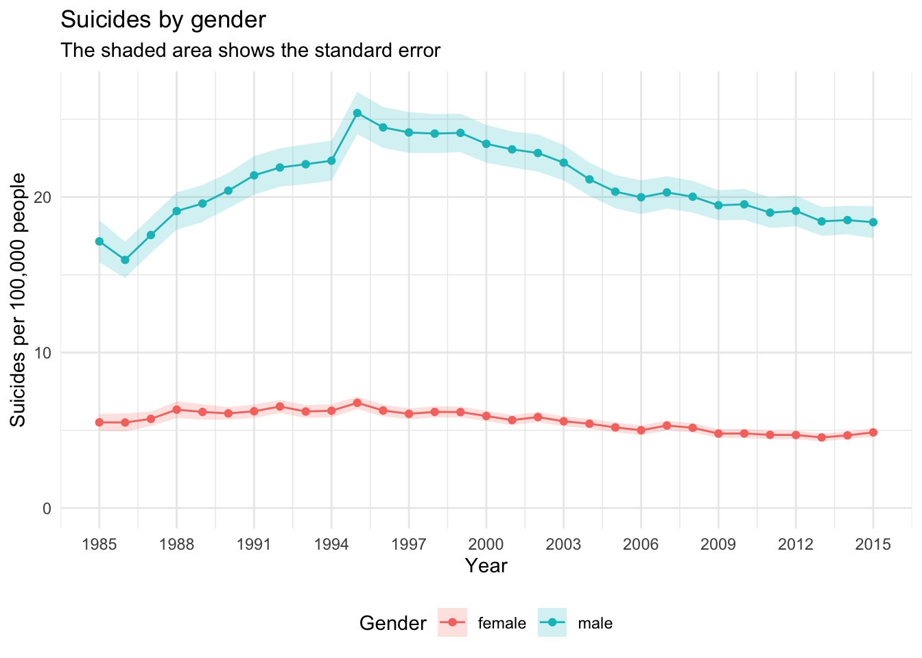
From this plot we can see that suicide rates are generally much higher in men than in women. For women the rate remains rather constant at around 5 per 100,000 people, while for men it is at around 20 and fluctuates much more.
We can further illustrate the disparity by gender.
gender_disparity <- suicide %>%
  group_by(country, sex) %>%
  summarise(mean = mean(suicides_100k_pop)) %>%
  tidyr::spread(sex, mean) %>%
  rowwise() %>%
  mutate(overall = mean(c(male, female))) %>%
  ungroup()

gender_disparity %>%
  arrange(overall) %>%
  mutate(country = factor(country, levels = country)) %>%
  ggplot() +
  aes(y = country, xmin = female, xmax = male) +
  geom_errorbarh(height = 0, colour = "grey80") +
  geom_point(aes(x = female), colour = "red4") +
  geom_point(aes(x = male), colour = "green4") +
  geom_point(aes(x = overall), colour = "midnightblue", size = 0.5) +
  labs(title = "Suicide gender disparity",
       subtitle = "Rates per 100,000 people by gender and mean",
       y = "Country",
       x = "Gender Disparity") +
  theme_minimal()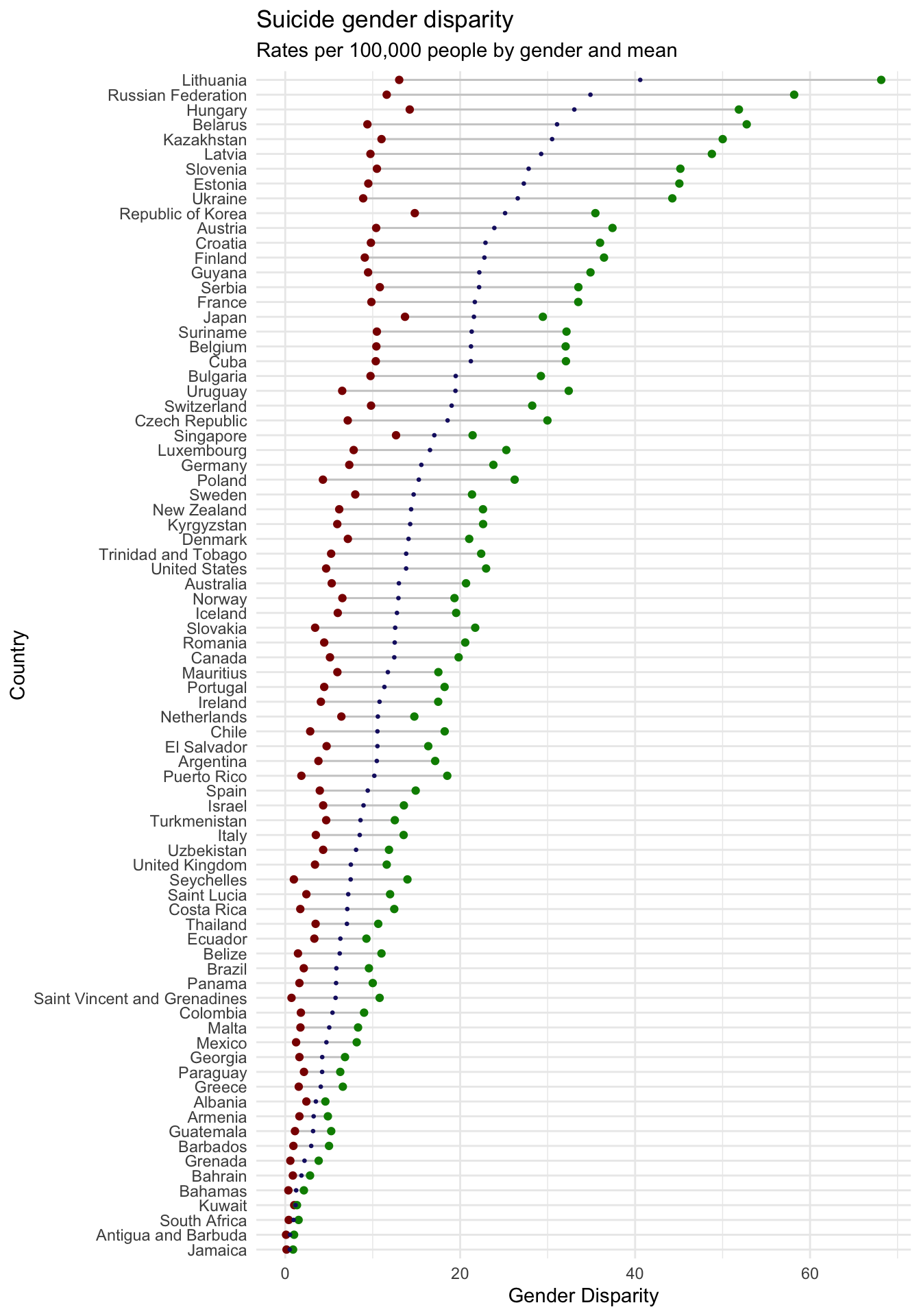
The plot shows the averages for the entire available time frame, so more long term trends are visualised. There seems to be a trend that the higher the overall suicide rate, the larger is the disparity in absolute numbers. Red data points indicate rates for women, green points rates for men, with the smaller blue dot showing the mean.
Age group
As the data is available, let’s also have a look at data about age groups:
# fix age sorting
by_age_group <- suicide %>%
  mutate(age = stringr::str_replace(.$age, "5-14", "05-14")) %>%
  mutate(age = as.factor(age)) %>%
  group_by(year, age) %>%
  summarise(mean = mean(suicides_100k_pop),
            se = sd(suicides_100k_pop) / sqrt(n()))

ggplot(by_age_group) +
  aes(x = year, y = mean, ymin = mean - se, ymax = mean + se,
      colour = age, fill = age, group = age) +
  geom_ribbon(alpha = .2, colour = NA) +
  geom_line() +
  geom_point() +
  scale_x_continuous(breaks = plot_breaks) +
  labs(x = "Year", y = "Suicides per 100,000 people",
       title = "Suicide rates in different age groups",
       subtitle = "Shaded areas indicate the standard error of the mean",
       colour = "Age", fill = "Age") +
  theme_minimal() +
  theme(legend.position = "bottom")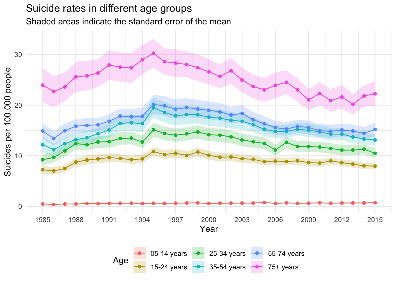
This plot strongly suggests that the older a person is, the likelier they commit suicide. The 75+ years age group is clearly at the top, the 5-14 years group pretty much at the bottom and the rest somewhat close together in the middle.
Wealth and suicide
There is information about GDP and GDP per Capita in the data. This can be used as indicator for overall wealth, but that approach is not without issue, as it does not really provide insight about an individual’s situation, but only provides a rough population average.
by_gdp_per_capita <- suicide %>%
  group_by(country, year) %>%
  summarise(mean = mean(suicides_100k_pop),
            se = sd(suicides_100k_pop) / sqrt(n()),
            continent = first(continent),
            gdp_per_capita = mean(gdp_per_capita)) # workaround,

ggplot(by_gdp_per_capita) +
  aes(x = gdp_per_capita, y = mean) +
  geom_point(aes(colour = continent), alpha = .5) +
  geom_smooth(method = "lm") +
  labs(x = "GDP per capita (USD)", y = "Suicides per 100,000 people",
       colour = "Continent",
       title = "Suicides by GDP per capita") +
  scale_x_continuous(breaks = seq(
    0, max(by_gdp_per_capita$gdp_per_capita), 10000)) +
  theme_minimal() +
  theme(legend.position = "bottom")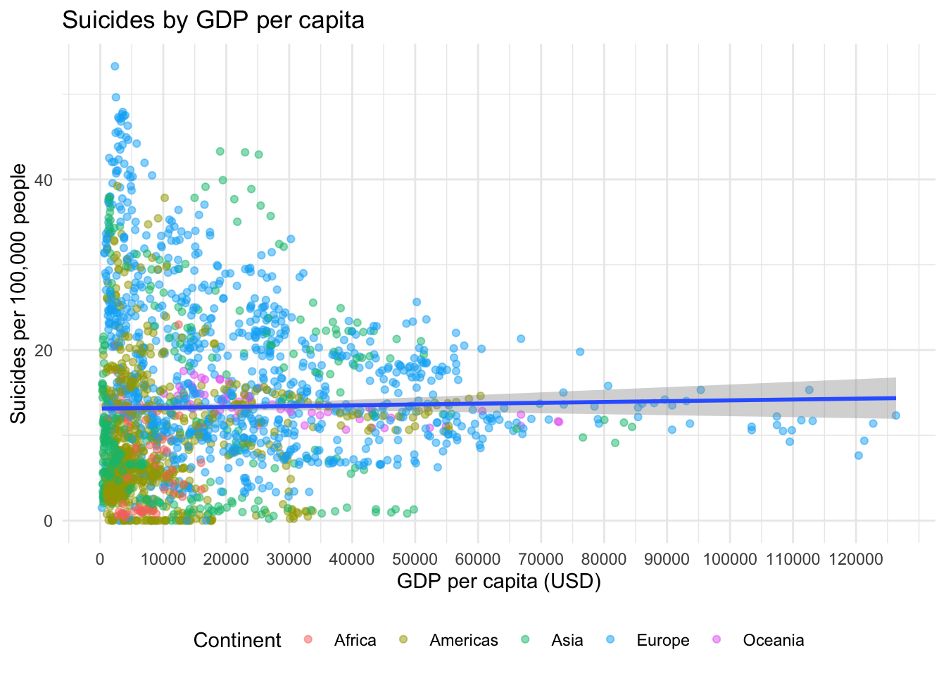
There is a slight linear trend in the data, but just from the appearance I would say that GPD per capita is not exactly a driver of suicide. A quick linear model (which has issues, as the data is non-normal and heteroscedastic) confirms that there is not much of a trend:
gdp_mod <- lm(suicides_100k_pop ~ gdp_per_capita, data = suicide)
summary(gdp_mod)
##
## Call:
## lm(formula = suicides_100k_pop ~ gdp_per_capita, data = suicide)
##
## Residuals:
## Min 1Q Median 3Q Max
## -14.353 -12.112 -6.754 4.095 191.673
##
## Coefficients:
## Estimate Std. Error t value Pr(>|t|)
## (Intercept) 1.313e+01 1.606e-01 81.722 <2e-16 ***
## gdp_per_capita 9.716e-06 6.389e-06 1.521 0.128
## ---
## Signif. codes: 0 '***' 0.001 '**' 0.01 '*' 0.05 '.' 0.1 ' ' 1
##
## Residual standard error: 19.08 on 25750 degrees of freedom
## Multiple R-squared: 8.98e-05, Adjusted R-squared: 5.097e-05
## F-statistic: 2.313 on 1 and 25750 DF, p-value: 0.1283To put it in more human readable terms, we can extract the estimate from the model and multiply it by 10,000:
gdp_mod$coefficients[2] * 10000## gdp_per_capita
## 0.09715646A change of 0.097 in suicides per 100,000 people per 10,000 USD gdp per capita is not exactly a large effect.
Suicides by country
Finally, let’s have a look at how suicides develop for each country and whether there are trends. For each country a linear model is created so we can then identify those with the largest weights in both increasing and decreasing direction.
country_models <- suicide %>%
  # make sure data for countries are in order, so the association of models
  # to countries later is correct
  arrange(country) %>%
  group_by(country) %>%
  # apply lm to each group, i.e. country
  group_map(~lm(suicides_100k_pop ~ year, data = .)) %>%
  # get a nice overview ...
  purrr::map(broom::tidy) %>%
  # ... and paste it togehter
  do.call(rbind, .) %>%
  # finally add the country to the data
  tibble::add_column(country = rep(unique(suicide$country), each = 2))

most_increasing <- country_models %>%
  filter(term == "year") %>%
  arrange(desc(estimate)) %>%
  select(country) %>%
  slice(1:12) %>%
  tibble::deframe()

most_decreasing <- country_models %>%
  filter(term == "year") %>%
  arrange(estimate) %>%
  select(country) %>%
  slice(1:12) %>%
  tibble::deframe()
First plot the development in countries with increasing rates over the available time frame.
suicide %>%
  filter(country %in% most_increasing) %>%
  group_by(country, year) %>%
  summarise(mean = mean(suicides_100k_pop)) %>%
  ggplot() +
    aes(x = year, y = mean, colour = country, fill = country) +
    geom_point(alpha = .4) +
    geom_smooth(method = "lm", alpha = .2) +
    guides(colour = FALSE, fill = FALSE) +
    labs(y = "Suicides per 100,000 people", x = "Year",
         title = "Most increasing suicide rates 1985-2015") +
    facet_wrap(~country, ncol = 4, nrow = 3) +
    theme_minimal()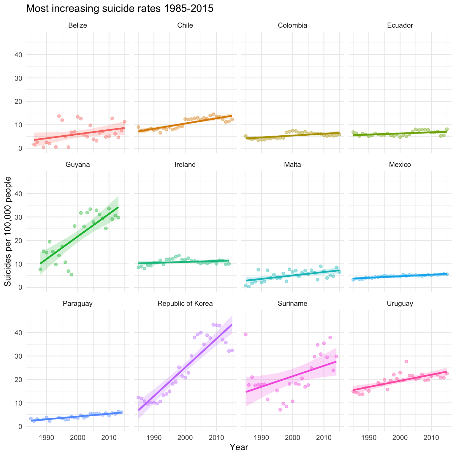
This plot illustrates that from those countries with the steepest slopes indicating an increase in suicide rates, there are a few that stand out, namely Guyana, the Republic of Korea (South Korea), Suriname and Uruguay.
Of course, increasing suicide rates for the other eight countries for which data is shown here is a reason for concern, but the trend is much smaller.
suicide %>%
  filter(country %in% most_decreasing) %>%
  group_by(country, year) %>%
  summarise(mean = mean(suicides_100k_pop)) %>%
  ggplot() +
    aes(x = year, y = mean, colour = country, fill = country) +
    geom_point(alpha = .4) +
    geom_smooth(method = "lm", alpha = .2) +
    guides(colour = FALSE, fill = FALSE) +
    labs(y = "Suicides per 100,000 people", x = "Year",
         title = "Most decreasing suicide rates 1985-2015") +
    facet_wrap(~country, ncol = 4, nrow = 3) +
    theme_minimal()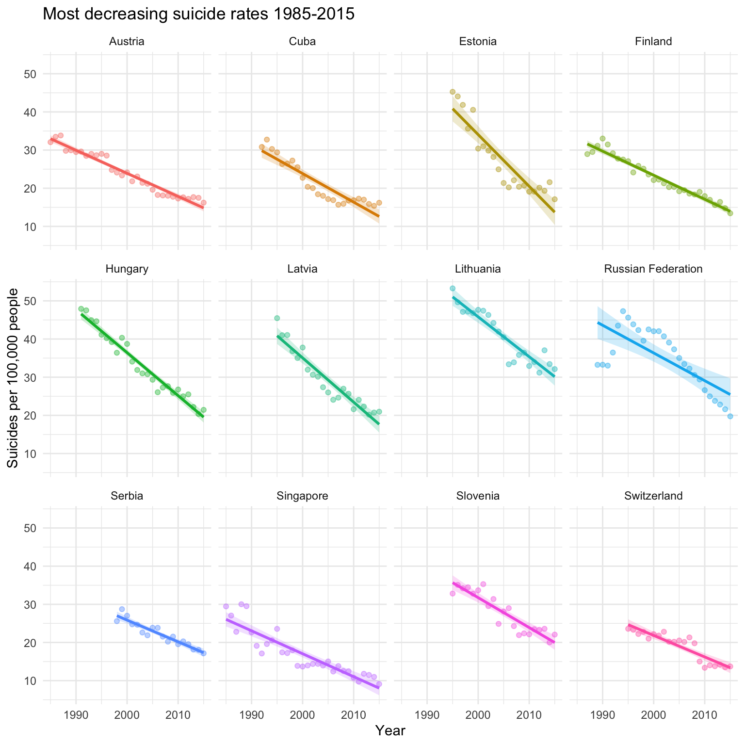
Contrary to the plot with increasing trends, we do see primarily rather steep trends here. These are the twelve steepest downward slopes, so there may be a few more countries with similarly decreasing suicide rates. However, we can see that there are quite a few countries included in this plot for which data is not available for the entire data range, so some of the results should be interpreted with caution.
Conclusions
The available data is somewhat limited and suicide is a rather complex issue. In-depth conclusions on suicide can not be drawn from the data that is available, but some patterns could be identified:
- In all countries for which data is available, men commit suicide more often than women. The extent of the disparity between genders varies, but there is not a single country with an opposite pattern. This is in line with the public health situation regarding mental health for men being less than optimal as expressing emotion and mental health issues is particularly stigmatised for men (while at the same time physical health problems in women are often not taken seriously).
- Older people commit suicide more often than younger people, with suicide rates in children being close to zero. The fact that older people are much more likely to commit suicide is to some extent likely the result of severe disease being more common in high age as well as specific mental health issues associated with high age.
- Trends in suicide rates vary heavily between countries. This is not too surprising as problem in society and public health are often country specific. On the positive side of things, there are more countries with strongly declining suicide rates than those with strongly increasing rates. Of the twelve countries with most decreasing suicide rates in the data ten are located in Europe, but only two European countries are among the twelve with the most increasing suicide rates.