Statistics, Science, Random Ramblings
A blog about data and other interesting things
Analysing points in the Eurovision Song Contest
The Eurovision Song Contest (ESC) is a yearly event featuring cheesy music, fancy outfits and spectacular performances. While primarily a music event featuring performers from all over Europe (and beyond), some say it is more about the kitsch than anything else. As there is one performer per country, some also say that it is primarily about politics and how much people from certain countries like each other.
This post takes a closer look at which countries (if any) tend to routinely give points to each other. The data used for this analysis can be found on Kaggle and all the code is available on my Gitlab.
The data
As always there is some data cleaning involved and as it is rather boring I’ll just quickly summarise it.
library("tidyverse")
esc_n <- readRDS("esc_n.Rds")
Cleaning included:
- Fixing and harmonising of the spelling of countries
- Omitting data not part of the final of the ESC (newer editions also have semi-finals due to the number of entrants)
- Averaging for each relation between participating counties, and creating a normalised score.
The final data looks like this:
esc_n## # A tibble: 2,401 x 6
## from_std to_std pointsum count adj_score adj_scale
## <chr> <chr> <dbl> <int> <dbl> <dbl>
## 1 Albania Armenia 0.542 10 0.0542 0.650
## 2 Albania Australia 1.5 5 0.3 3.6
## 3 Albania Austria 0.5 7 0.0714 0.857
## 4 Albania Azerbaijan 2.46 11 0.223 2.68
## 5 Albania Belarus 0.167 6 0.0278 0.333
## 6 Albania Belgium 0.292 6 0.0486 0.583
## 7 Albania Bosnia & Herzegovina 4 9 0.444 5.33
## 8 Albania Bulgaria 1.92 4 0.479 5.75
## 9 Albania Croatia 0.458 7 0.0655 0.786
## 10 Albania Cyprus 2.21 9 0.245 2.94
## # … with 2,391 more rowsWith the columns being:
from_std: the country giving points.to_std: the country receiving points.pointsum: the sum of the average points on that relation (average as some editions contain separate jury and viewer votes), scaled to be between 0 and 1.count: the amount of times that relation was present in the contest.adj_score:pointsum/count, to take car of the frequency of common participationsadj_scale:adj_score* 12, to put the adjusted score on the same scale as points at the ESC.
Exploring relations
As a first approach it seems useful to sort the data by adj_scale to see
which relations are the strongest:
arrange(esc_n, desc(adj_scale))## # A tibble: 2,401 x 6
## from_std to_std pointsum count adj_score adj_scale
## <chr> <chr> <dbl> <int> <dbl> <dbl>
## 1 Azerbaijan Turkey 4 4 1 12
## 2 Morocco Turkey 1 1 1 12
## 3 Serbia Montenegro 1 1 1 12
## 4 Turkey Azerbaijan 5 5 1 12
## 5 Montenegro Serbia 6.75 7 0.964 11.6
## 6 Moldova Romania 11.4 12 0.951 11.4
## 7 Romania Moldova 9.46 10 0.946 11.4
## 8 Cyprus Greece 27 29 0.931 11.2
## 9 Bosnia & Herzegovina Serbia 7.33 8 0.917 11
## 10 North Macedonia Albania 8.17 9 0.907 10.9
## # … with 2,391 more rowsWe can see that there are a few relations for which the score given was always the maximum possible (Azerbaijan <–> Turkey, Morocco –> Turkey and Serbia –> Montenegro). It is also apparent that many of the strongest relations have been present in the contest only a few times, thus we might want to filter for the amount of common participations.
esc_10 <- esc_n %>%
    filter(count >= 10) %>%
    arrange(desc(adj_scale))
esc_10
## # A tibble: 1,176 x 6
## from_std to_std pointsum count adj_score adj_scale
## <chr> <chr> <dbl> <int> <dbl> <dbl>
## 1 Moldova Romania 11.4 12 0.951 11.4
## 2 Romania Moldova 9.46 10 0.946 11.4
## 3 Cyprus Greece 27 29 0.931 11.2
## 4 Greece Cyprus 21.8 25 0.87 10.4
## 5 Belarus Russia 11.8 14 0.839 10.1
## 6 Armenia Russia 9.21 11 0.837 10.0
## 7 Croatia Serbia 7.75 10 0.775 9.3
## 8 Slovenia Serbia 8.46 11 0.769 9.23
## 9 Russia Azerbaijan 7.67 10 0.767 9.2
## 10 North Macedonia Serbia 8.38 11 0.761 9.14
## # … with 1,166 more rowsThe data has now become much shorter, a bit less than half of the original data. But at the same time we should now be seeing more long-standing relationships. Interestingly the strongest relations in this data are mutual; so Moldova and Romania as well as Cyprus and Greece tend to give each other a lot of points.
Let’s have a look at the distribution of mean point values:
esc_10d <- density(esc_10$adj_scale, from = min(esc_10$adj_scale),
                          to = max(esc_10$adj_scale))
esc_10_density_tbl <- tibble(x = esc_10d$x, y = esc_10d$y)
ggplot(esc_10_density_tbl) +
    aes(x = x, y = y) +
    geom_area(fill = "blue", alpha = .1) +
    geom_line(colour = "blue") +
    labs(x = "ESC Points", y = "Density")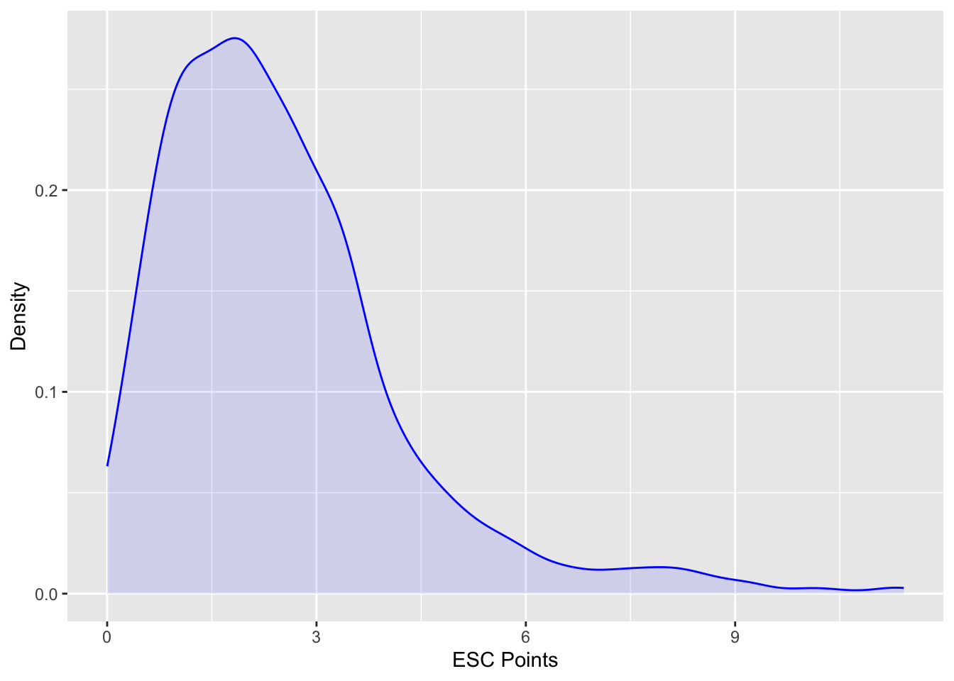
The plot illustrates that the majority of points on relations between countries is between 0 and 3 and only few relations are rather strong.
Visualising Networks
Given the properties of the data it seems straightforward to plot it as a network.
library("tidygraph")
library("ggraph")
When plotting the relations as network graph we need to find a convenient way to represent the countries, as the names are quite long. Thus, ISO 3166 codes provide a good alternative, as they are short and in most cases still easy to recognise.
The ISOcodes package provides the required data in a convenient way,
before merging this into the existing data country names have to be adapted,
though.
isocodes <- ISOcodes::ISO_3166_1
adapt_names <- c("Bosnia and Herzegovina" = "Bosnia & Herzegovina",
                 "Czechia"                = "Czech Republic",
                 "Moldova, Republic of"   = "Moldova",
                 "Macedonia, Republic of" = "North Macedonia",
                 "Russian Federation"     = "Russia",
                 "Netherlands"            = "The Netherlands")
isocodes <- mutate(isocodes, Name = recode(Name, !!!adapt_names)) %>%
    select(Alpha_3, Name)
esc_iso <- left_join(esc_n, isocodes, by = c("from_std" = "Name"))
esc_iso <- rename(esc_iso, "from_iso" = "Alpha_3")
esc_iso <- left_join(esc_iso, isocodes, by = c("to_std" = "Name"))
esc_iso <- rename(esc_iso, "to_iso" = "Alpha_3")
esc_iso
## # A tibble: 2,401 x 8
## from_std to_std pointsum count adj_score adj_scale from_iso to_iso
## <chr> <chr> <dbl> <int> <dbl> <dbl> <chr> <chr>
## 1 Albania Armenia 0.542 10 0.0542 0.650 ALB ARM
## 2 Albania Australia 1.5 5 0.3 3.6 ALB AUS
## 3 Albania Austria 0.5 7 0.0714 0.857 ALB AUT
## 4 Albania Azerbaijan 2.46 11 0.223 2.68 ALB AZE
## 5 Albania Belarus 0.167 6 0.0278 0.333 ALB BLR
## 6 Albania Belgium 0.292 6 0.0486 0.583 ALB BEL
## 7 Albania Bosnia & He… 4 9 0.444 5.33 ALB BIH
## 8 Albania Bulgaria 1.92 4 0.479 5.75 ALB BGR
## 9 Albania Croatia 0.458 7 0.0655 0.786 ALB HRV
## 10 Albania Cyprus 2.21 9 0.245 2.94 ALB CYP
## # … with 2,391 more rowsNow the data can be transformed into a tidygraph object.
In addition to generation of the graph object the data is filtered to include
only those relations that have a certain strength.
The plots become really messy really fast when not limiting the data by strength
of connecections (i.e. by average score) and using certain graph metrics like
the node degree can no longer be used for conclusions on long-standing
relationships as the graph will be almost fully connected.
To filter the data we might want to choose a value derived from the data, such as the 90th percentile.
score_pr <- quantile(esc_iso$adj_scale, probs = seq(0, 1, 0.01))
cutoff <- score_pr[91]
cutoff
## 90%
## 4.775esc_g <- filter(esc_iso, count >= 10, adj_scale >= cutoff) %>%
select(from_iso, to_iso, adj_scale) %>%
as_tbl_graph()
esc_g## # A tbl_graph: 42 nodes and 104 edges
## #
## # A directed simple graph with 1 component
## #
## # Node Data: 42 x 1 (active)
## name
## <chr>
## 1 ALB
## 2 ARM
## 3 AUT
## 4 AZE
## 5 BLR
## 6 BEL
## # … with 36 more rows
## #
## # Edge Data: 104 x 3
## from to adj_scale
## <int> <int> <dbl>
## 1 1 17 8.86
## 2 2 17 6.32
## 3 2 33 10.0
## # … with 101 more rowsWe then calculate the in-degree and out-degree for each node (country) and apply a clustering algorithm to detect communities in the graph. So, it should become visible which countries are the most generous and which countries profit the most from inter-country relations in the ESC. Due to clustering we should also be able to see whether there are groups of countries mainly giving large amounts of points to each other.
esc_g <- mutate(esc_g, receiving = centrality_degree(mode = "in"),
                       giving = centrality_degree(mode = "out"),
                       community = as.factor(group_infomap()))
esc_g
## # A tbl_graph: 42 nodes and 104 edges
## #
## # A directed simple graph with 1 component
## #
## # Node Data: 42 x 4 (active)
## name receiving giving community
## <chr> <dbl> <dbl> <fct>
## 1 ALB 0 1 2
## 2 ARM 6 3 2
## 3 AUT 0 2 3
## 4 AZE 7 2 1
## 5 BLR 0 3 1
## 6 BEL 2 1 2
## # … with 36 more rows
## #
## # Edge Data: 104 x 3
## from to adj_scale
## <int> <int> <dbl>
## 1 1 17 8.86
## 2 2 17 6.32
## 3 2 33 10.0
## # … with 101 more rowsFor visualising the different network metrics it makes sense to use a common template, so we do not end up with three different distributions of nodes.
max_deg <- as_tibble(esc_g) %>%
    summarise(re = max(receiving), gi = max(giving))

esc_net_base <- ggraph(esc_g, layout = "fr") +
    geom_edge_parallel(
        arrow = arrow(length = unit(2, 'mm')),
        sep = unit(4, 'mm'),
        aes(start_cap = circle(0.4), end_cap = circle(0.4),
            alpha = adj_scale)) +
    theme_graph()
Visualising graphs tends to be a bit of trial and error, so the exact choices for things like the laout and arrow properties were pretty much generated iteratively.
And now plot, first with in-degree:
esc_net_r <- esc_net_base +
  geom_node_point(size = 10, alpha = 0.75, colour = "grey80") +
  geom_node_text(aes(label = name, colour = receiving), size = 3) +
  scale_colour_gradient(low = "black", high = "red",
                        breaks = 1:deframe(max_deg$re))

esc_net_r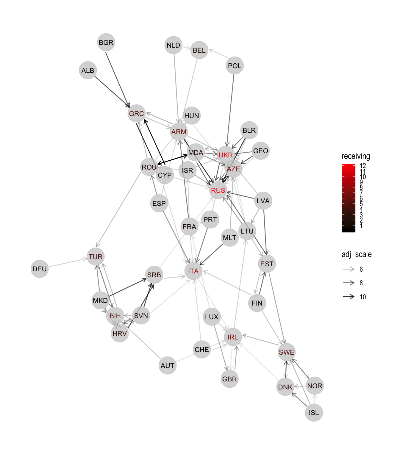
The plot is not perfect, but we can see what we are interested in. Russia and Ukraine seem to be the most profiting from long-term relationships, with some other countries (Italy, Sweden, Armenia, Bosnia & Herzegovina and more) also profiting from long-term relationships.
This can also be verified by looking at the data:
esc_g %>%
  activate(nodes) %>%
  as_tibble() %>%
  select(name, receiving) %>%
  arrange(desc(receiving))
## # A tibble: 42 x 2
## name receiving
## <chr> <dbl>
## 1 RUS 12
## 2 UKR 11
## 3 ITA 9
## 4 AZE 7
## 5 IRL 7
## 6 ARM 6
## 7 BIH 5
## 8 GRC 5
## 9 SWE 5
## 10 TUR 4
## # … with 32 more rowsLet’s look at the out-degree:
esc_net_g <- esc_net_base +
  geom_node_point(size = 10, alpha = 0.75, colour = "grey80") +
  geom_node_text(aes(label = name, colour = giving), size = 3) +
  scale_colour_gradient(low = "black", high = "red",
                        breaks = 1:deframe(max_deg$gi))

esc_net_g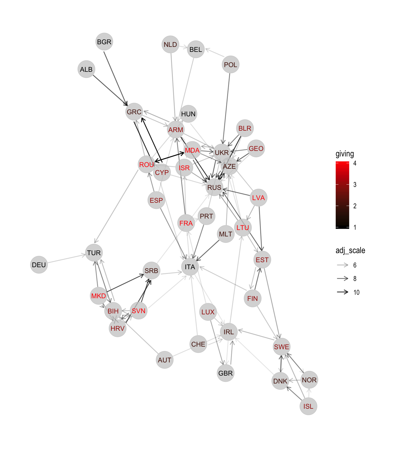
We can see quite clearly that the out-degree is distributed much more equally, with the highest degree being 4. No single country can be pointed out as being the most generous.
Again, we can also show the table.
esc_g %>%
  activate(nodes) %>%
  as_tibble() %>%
  select(name, giving) %>%
  arrange(desc(giving))
## # A tibble: 42 x 2
## name giving
## <chr> <dbl>
## 1 FRA 4
## 2 ISR 4
## 3 LVA 4
## 4 LTU 4
## 5 MDA 4
## 6 MKD 4
## 7 ROU 4
## 8 SVN 4
## 9 ARM 3
## 10 BLR 3
## # … with 32 more rowsFinally, we can also visualise communities:
esc_net_c <- esc_net_base +
  geom_node_point(size = 10, alpha = 0.75, aes(colour = community)) +
  geom_node_text(aes(label = name), size = 3)

esc_net_c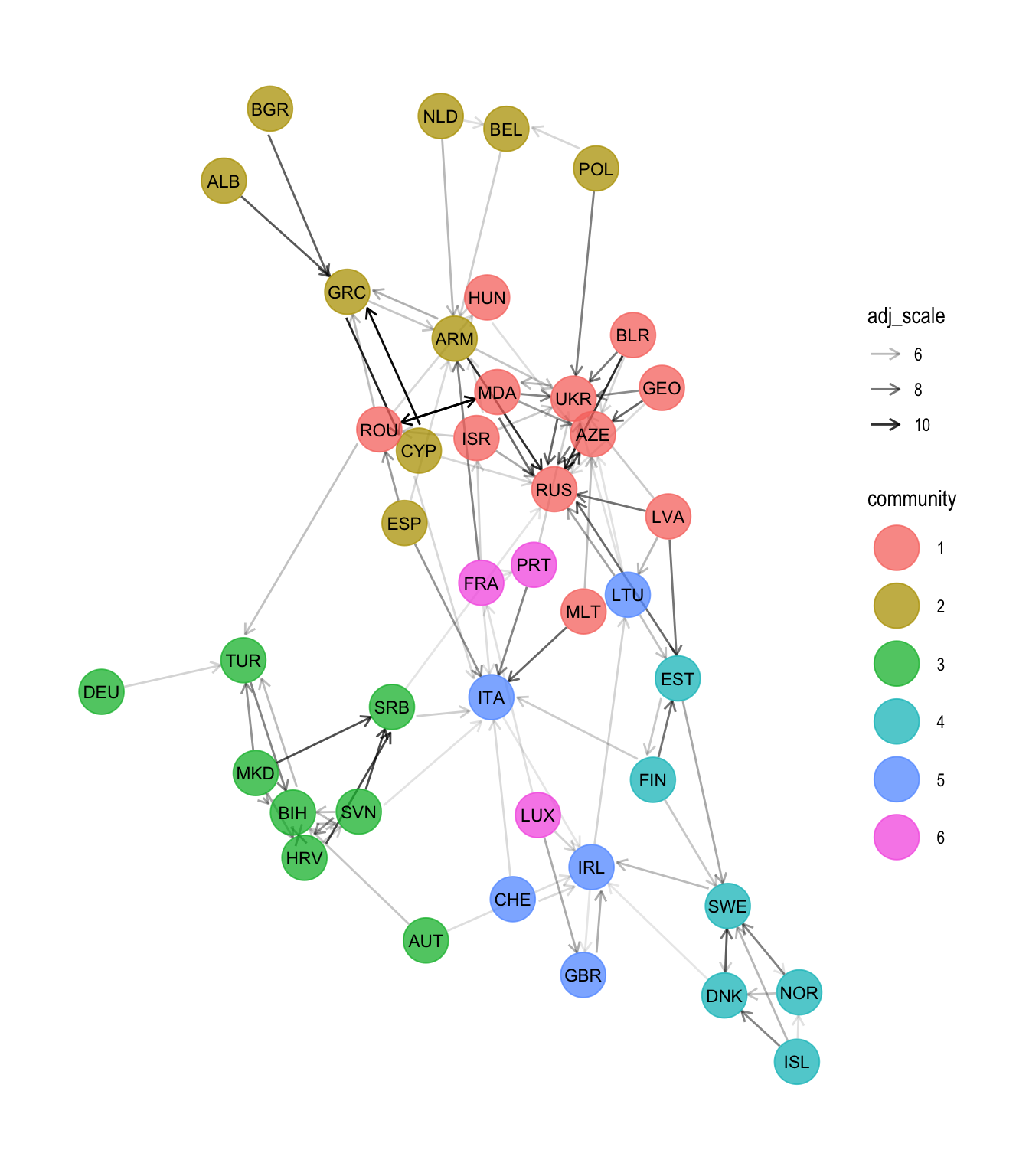
The communities the nodes are assigned to are pretty interesting. The green community 3 covers mainly the Balkans, while the turquoise network 4 encompasses the Nordics. The red network 1 appears to consist mainly of Russia, some of its neighbours and/or countries with significant portions of the population that are ethnic Russians (Malta is the striking oddball here). I can not spot anything noteworthy about the remaining three communities (albeit yellow/2 appears to have a Greece-centric portion).
Concluding Remarks
If you regularly watch the ESC you probably have thought something like I knew it all along! while reading this. Some of the relations appear to be rooted in geographic and/or cultural properties, but this can not be concluded with certainty from the data, it could very well also be that the music is what drives these scores.
The Shiny app in the repository allows visualising the relationships as a map, which can also be interesting to see, as it is less abstract than the network plots above.