Statistics, Science, Random Ramblings
A blog about data and other interesting things
Exploring base R plots
I have been using R for over a decade now.
Until I stumbled across ggplot2 in a version pre 1.0 I thought that plots in
R are kind of ugly and one of R’s weak points.
Since then I my knowledge and skills regarding R have improved quite a bit,
but I have never really bothered to have a second look at base plots.
Well, let’s change this.
We will be using the palmerpenguins data set.
data("penguins", package = "palmerpenguins")First, we start with the most basic plot we can do.
plot(penguins$flipper_length_mm, penguins$body_mass_g)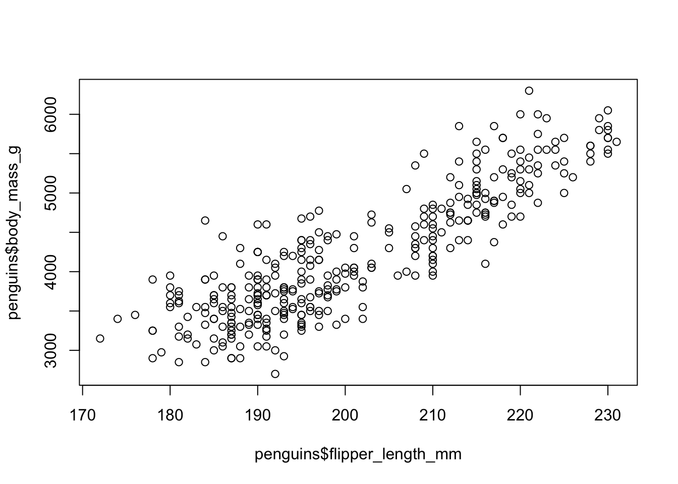
This… does not look nice.
But we can do better! First, we can improve the axis labels and we also should be more specific when it comes to telling R which type of plot we want (the default is a scatter plot, but it is always good to be specific).
plot(x    = penguins$flipper_length_mm,
     y    = penguins$body_mass_g,
     type = "p",
     xlab = "Flipper Length (mm)",
     ylab = "Body Mass (g)")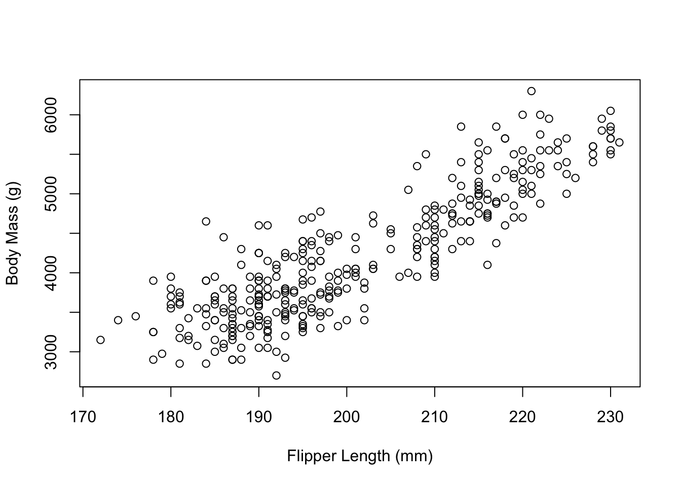
Next, we might want to have a look at changing the box around the plot.
By reading the documentation a bit, we soon find graphics::par giving us a
list of graphical parameters we can set to change the appearance of our plot.
Here, we find the bty parameter.
A character string which determined the type of box which is drawn about plots. If bty is one of “o” (the default), “l”, “7”, “c”, “u”, or “]” the resulting box resembles the corresponding upper case letter. A value of “n” suppresses the box.
We probably want l.
plot(x    = penguins$flipper_length_mm,
     y    = penguins$body_mass_g,
     type = "p",
     xlab = "Flipper Length (mm)",
     ylab = "Body Mass (g)",
     bty  = "l")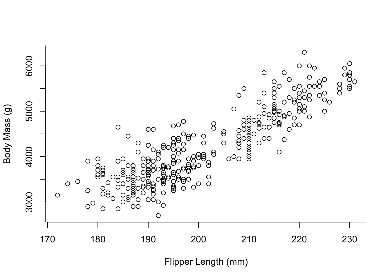
The data we use contains information on 3 different species of penguins. For our visualisation we might want to colour them differently.
palette(hcl.colors(3, "viridis"))
plot(x    = penguins$flipper_length_mm,
     y    = penguins$body_mass_g,
     col  = penguins$species,
     type = "p",
     xlab = "Flipper Length (mm)",
     ylab = "Body Mass (g)",
     bty  = "l")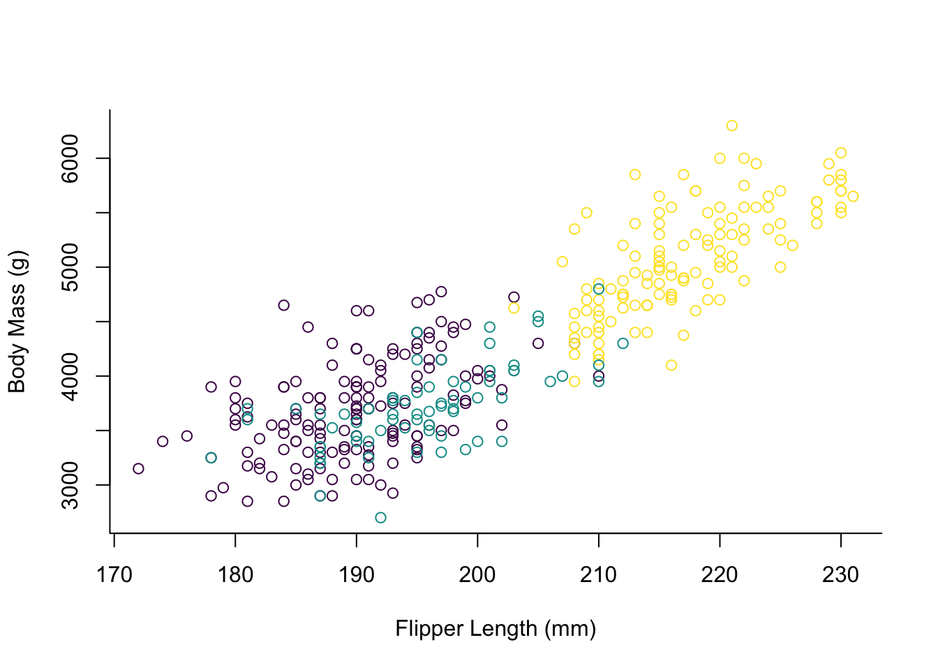
The way one has to specify the custom palette here seems to be a bit unusual
if you are used to ggplot2.
By default the points would be coloured red, green and black, but we elect to
use the viridis palette here which is colour-blindness friendly.
For some more tweaking the appearance of the plot we should make the points solid and add a legend.
par(mai = c(1, 1, 0.4, 1.5))
palette(hcl.colors(3, "viridis"))
plot(x    = penguins$flipper_length_mm,
     y    = penguins$body_mass_g,
     col  = penguins$species,
     pch  = 16,
     type = "p",
     xlab = "Flipper Length (mm)",
     ylab = "Body Mass (g)",
     bty  = "l")
legend(x = 235,
       y = 6000,
       legend = levels(penguins$species),
       col = hcl.colors(3, "viridis"),
       pch = 16,
       bty = "o",
       title = "Species",
       xpd = TRUE)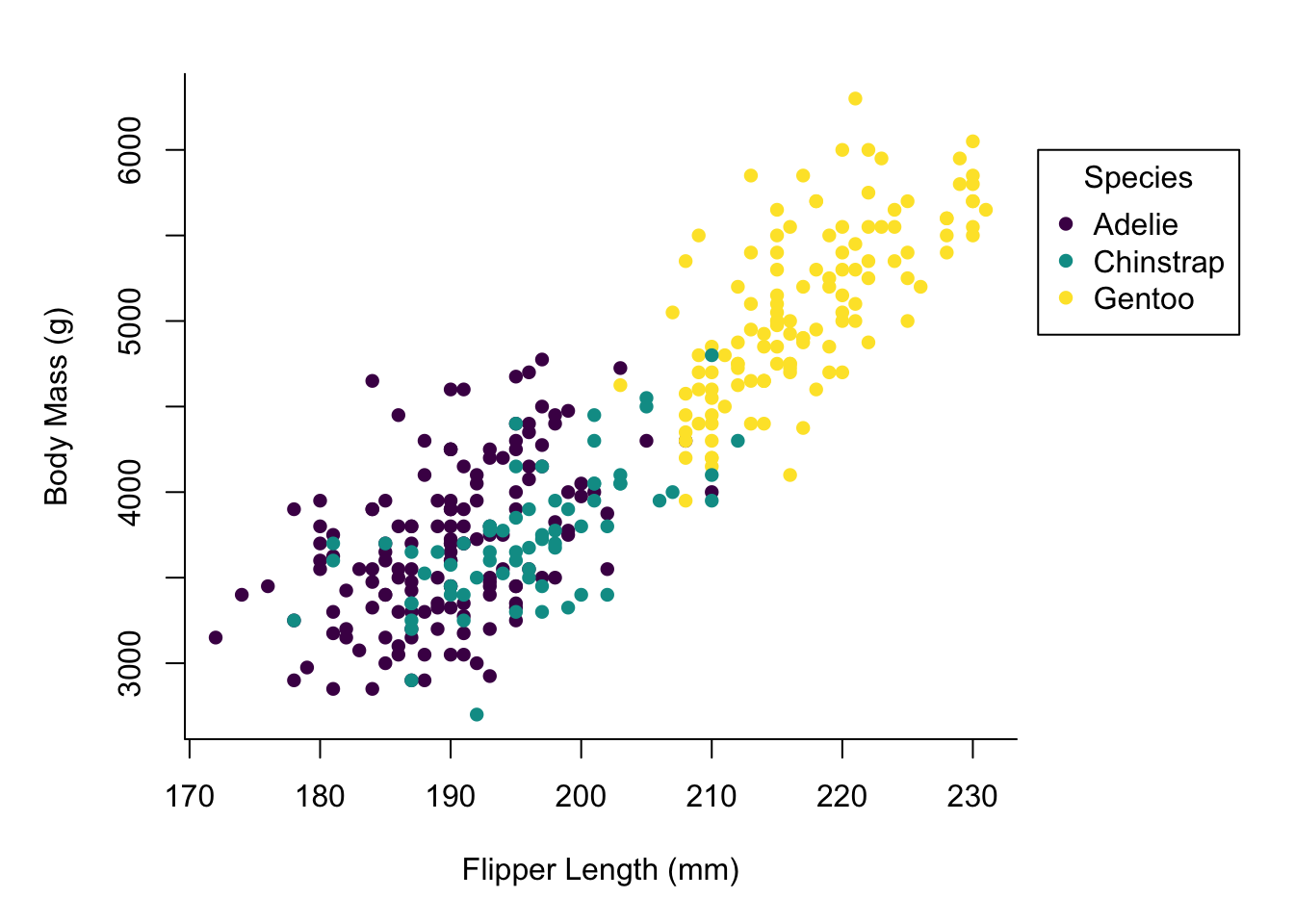
Okay, there is a lot of stuff going on here.
One noteworthy thing is that several function calls that appear to be
independent act on the same plot.
This is very different from ggplot2 where you chain the things you add to
the plot by using +.
However with base plots plotting functions will act on the currently
active plot device until dev.off() or plot.new() is called.
Here, we first set the margins of our plot, so we can later put our legend
outside of the main plotting area.
Looking at the documentation for par, there are a lot of graphical
parameters.
A lot of those can be passed to plotting functions (like bty in our
call to plot), but for some more fundamental things it appears to be necessary
to set them in a call to par before plotting anything.
The call to plot now also has the argument pch = 16 specifying solid
points, instead of the circles we had before.
Finally, we have our legend specification.
Most of the arguments in there should be straightforward, but note the
specification of xpd = TRUE allowing us to draw the legend outside of the
main plotting area.
At this point we already have a decent looking plot, but we might want to add some finishing touches. First of all, a LOESS smooth line for the relation between flipper length and body mass.
mod <- loess(body_mass_g ~ flipper_length_mm, data = penguins)
smooth_data <- predict(mod, penguins, se = TRUE)
idx <- order(penguins$flipper_length_mm)
smooth_fit <- smooth_data$fit[idx]
smooth_se_max <- smooth_fit + smooth_data$se.fit[idx]
smooth_se_min <- smooth_fit - smooth_data$se.fit[idx]
We first need to build the model, then generate the data and retrieve the order of values for properly plotting it.
par(mai = c(1, 1, 0.4, 1.5))
palette(hcl.colors(3, "viridis"))
plot(x    = penguins$flipper_length_mm,
     y    = penguins$body_mass_g,
     col  = penguins$species,
     pch  = 16,
     type = "p",
     xlab = "Flipper Length (mm)",
     ylab = "Body Mass (g)",
     bty  = "l")
polygon(x = c(rev(penguins$flipper_length_mm[idx]),
              penguins$flipper_length_mm[idx]),
        y = c(rev(smooth_se_max), smooth_se_min),
        col = "#00000020",
        lty = "blank")
lines(x = penguins$flipper_length_mm[idx],
      y = smooth_se_max,
      lty = "dotted")
lines(x = penguins$flipper_length_mm[idx],
      y = smooth_se_min,
      lty = "dotted")
lines(x = penguins$flipper_length_mm[idx],
      y = smooth_fit,
      col = "black")
legend(x = 235,
       y = 6000,
       legend = levels(penguins$species),
       col = hcl.colors(3, "viridis"),
       pch = 16,
       bty = "o",
       title = "Species",
       xpd = TRUE)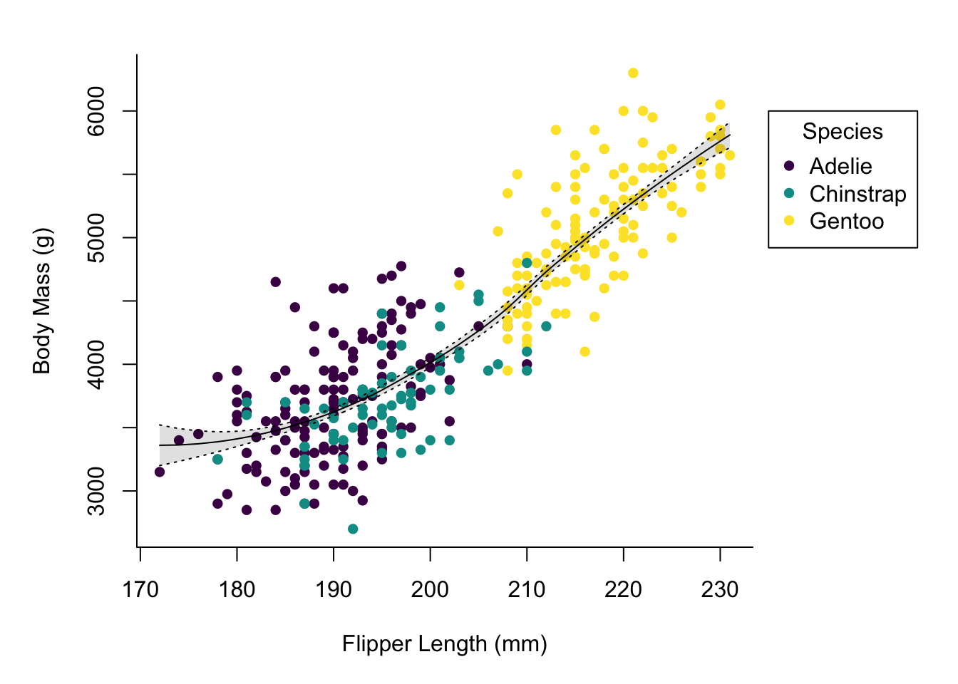
In addition to building the model and extracting the relevant values we
added a polygon and three more lines to the plot.
The polygon is used for the shaded area and I confess, figuring out the right
way of building it using rev on some of the input data was a bit fiddly.
The additional lines are the LOESS curve on the data and the borders of the
region marking the standard error.
Using lty one can specify a line type, in this case you can just supply
a name, which is different from the pch argument for points where you
must specify a number (but pch has much more possible values than lty).
Up next we might want to add grid lines.
par(mai = c(1, 1, 0.4, 1.5))
palette(hcl.colors(3, "viridis"))
plot(x    = penguins$flipper_length_mm,
     y    = penguins$body_mass_g,
     col  = penguins$species,
     pch  = 16,
     type = "p",
     xlab = "Flipper Length (mm)",
     ylab = "Body Mass (g)",
     bty  = "l",
     panel.first = grid(lty = "solid", col = "grey90"))
polygon(x = c(rev(penguins$flipper_length_mm[idx]),
              penguins$flipper_length_mm[idx]),
        y = c(rev(smooth_se_max), smooth_se_min),
        col = "#00000020",
        lty = "blank")
lines(x = penguins$flipper_length_mm[idx],
      y = smooth_se_max,
      lty = "dotted")
lines(x = penguins$flipper_length_mm[idx],
      y = smooth_se_min,
      lty = "dotted")
lines(x = penguins$flipper_length_mm[idx],
      y = smooth_fit,
      col = "black")
legend(x = 235,
       y = 6000,
       legend = levels(penguins$species),
       col = hcl.colors(3, "viridis"),
       pch = 16,
       bty = "o",
       title = "Species",
       xpd = TRUE)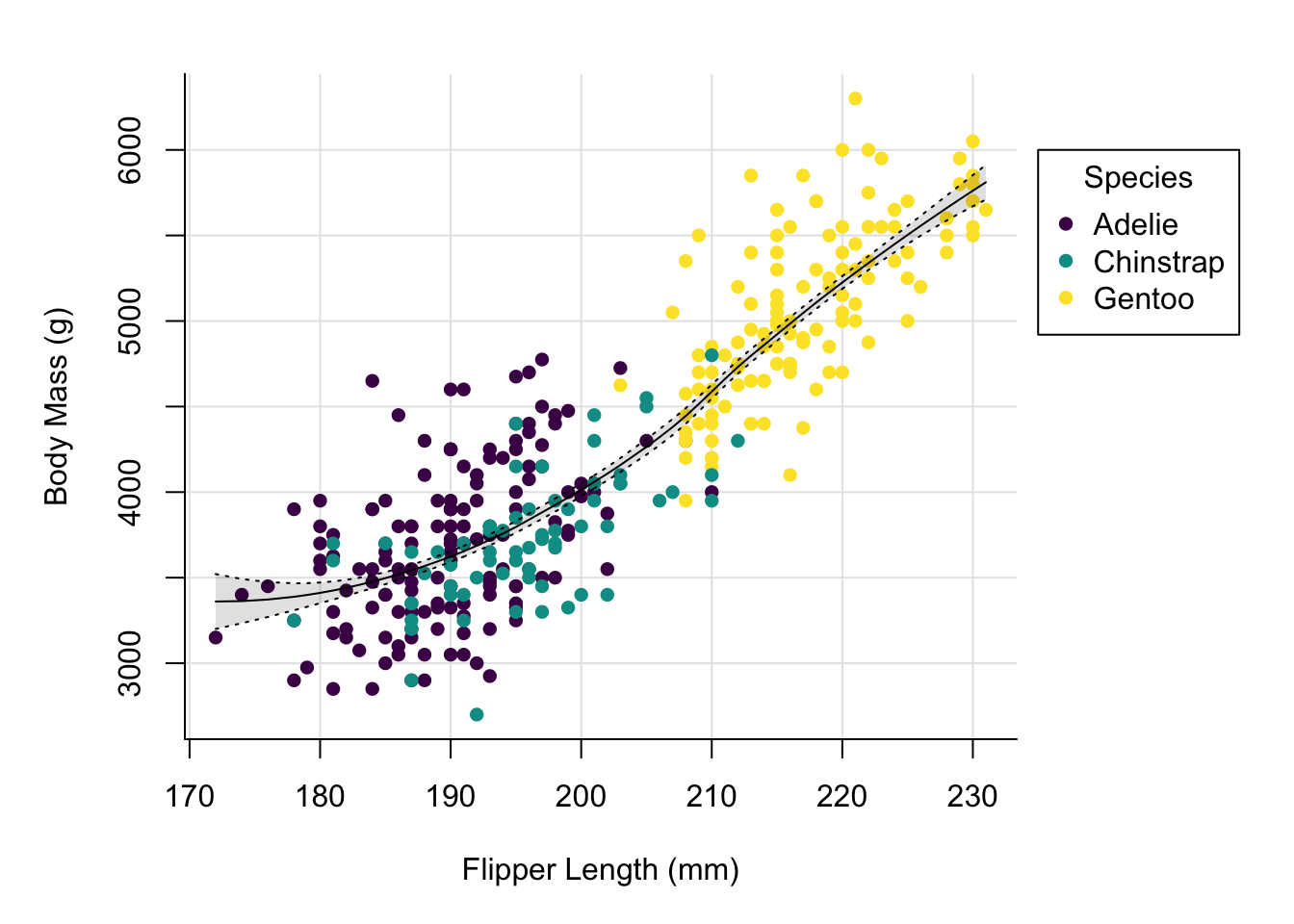
By adding the grid using the panel.first argument to plot we ensure that
the grid is not added on top of our data.
We might want to adjust the x-axis a little, as the break right at the beginning makes the grid line collide a bit with the y-axis.
par(mai = c(1, 1, 0.4, 1.5))
palette(hcl.colors(3, "viridis"))
plot(x    = penguins$flipper_length_mm,
     y    = penguins$body_mass_g,
     col  = penguins$species,
     pch  = 16,
     type = "p",
     xlab = "Flipper Length (mm)",
     ylab = "Body Mass (g)",
     bty  = "l",
     panel.first = grid(lty = "solid", col = "grey90"),
     xlim = c(167.5, 230))
polygon(x = c(rev(penguins$flipper_length_mm[idx]),
              penguins$flipper_length_mm[idx]),
        y = c(rev(smooth_se_max), smooth_se_min),
        col = "#00000020",
        lty = "blank")
lines(x = penguins$flipper_length_mm[idx],
      y = smooth_se_max,
      lty = "dotted")
lines(x = penguins$flipper_length_mm[idx],
      y = smooth_se_min,
      lty = "dotted")
lines(x = penguins$flipper_length_mm[idx],
      y = smooth_fit,
      col = "black")
legend(x = 235,
       y = 6000,
       legend = levels(penguins$species),
       col = hcl.colors(3, "viridis"),
       pch = 16,
       bty = "o",
       title = "Species",
       xpd = TRUE)
This looks nicer. Let’s now add a title and change the font.
par(mai = c(1, 1, 0.4, 1.5),
    family = "IBM Plex Sans")
palette(hcl.colors(3, "viridis"))
plot(x    = penguins$flipper_length_mm,
     y    = penguins$body_mass_g,
     col  = penguins$species,
     pch  = 16,
     type = "p",
     xlab = "Flipper Length (mm)",
     ylab = "Body Mass (g)",
     bty  = "l",
     panel.first = grid(lty = "solid", col = "grey90"),
     xlim = c(167.5, 230))
title(main = "Size measurements of penguins",
      adj = 0)
polygon(x = c(rev(penguins$flipper_length_mm[idx]),
              penguins$flipper_length_mm[idx]),
        y = c(rev(smooth_se_max), smooth_se_min),
        col = "#00000020",
        lty = "blank")
lines(x = penguins$flipper_length_mm[idx],
      y = smooth_se_max,
      lty = "dotted")
lines(x = penguins$flipper_length_mm[idx],
      y = smooth_se_min,
      lty = "dotted")
lines(x = penguins$flipper_length_mm[idx],
      y = smooth_fit,
      col = "black")
legend(x = 235,
       y = 6000,
       legend = levels(penguins$species),
       col = hcl.colors(3, "viridis"),
       pch = 16,
       bty = "o",
       title = "Species",
       xpd = TRUE)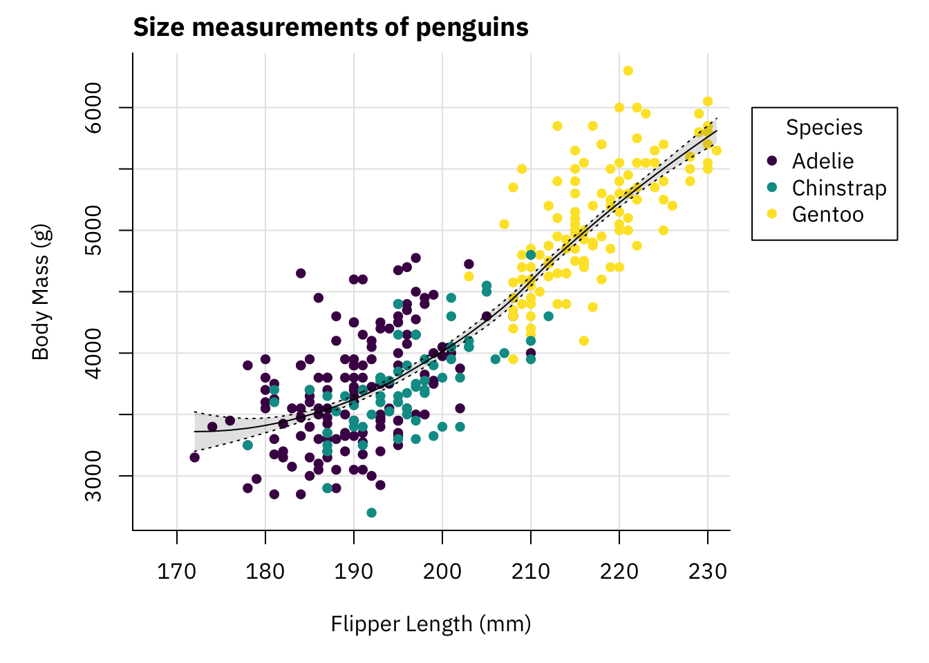
This plot looks pretty decent. To be honest if you showed me that plot without context I would not think it was made with base plots.
We can now save it to a file.
png("penguins.png", width = 1200, height = 800, res = 150)
par(mai = c(1, 1, 0.4, 1.5),
    family = "IBM Plex Sans")
palette(hcl.colors(3, "viridis"))
plot(x    = penguins$flipper_length_mm,
     y    = penguins$body_mass_g,
     col  = penguins$species,
     pch  = 16,
     type = "p",
     xlab = "Flipper Length (mm)",
     ylab = "Body Mass (g)",
     bty  = "l",
     panel.first = grid(lty = "solid", col = "grey90"),
     xlim = c(167.5, 230))
title(main = "Size measurements of penguins",
      adj = 0)
polygon(x = c(rev(penguins$flipper_length_mm[idx]),
              penguins$flipper_length_mm[idx]),
        y = c(rev(smooth_se_max), smooth_se_min),
        col = "#00000020",
        lty = "blank")
lines(x = penguins$flipper_length_mm[idx],
      y = smooth_se_max,
      lty = "dotted")
lines(x = penguins$flipper_length_mm[idx],
      y = smooth_se_min,
      lty = "dotted")
lines(x = penguins$flipper_length_mm[idx],
      y = smooth_fit,
      col = "black")
legend(x = 235,
       y = 6000,
       legend = levels(penguins$species),
       col = hcl.colors(3, "viridis"),
       pch = 16,
       bty = "o",
       title = "Species",
       xpd = TRUE)
dev.off()
Similar as with ggplot2 getting sizes right when writing to a file is a bit
hard with base plots as well.
So, how do base plots compare to ggplot2?
One thing ggplot2 excels at is providing a consistent interface and taking
care of a lot of stuff for you based on the aesthetics you specify.
For example, here we built the legend manually, ggplot2 does this
automatically for you.
Furthermore, ggplot2 comes with sane defaults and provides plots that at
least look okay without much tweaking, while base plots look not so nice
out of the box and require some tweaking to look good (this is of course
a very subjective thing).
Just from building this example here base plots seem a lot more flexible
compared to ggplot2.
Using ggplot2 adjusting details can sometimes be kind of hard.
With base plots it seems you can just throw some plotting functions at the
active graphics device and there are not many limitations.
This however comes at the cost of having to repeat yourself a bit, given the
plotting functions are independent of each other and are mostly unaware of
what has already been plotted.
I have not enough experience with using base plots so I have not run into limitations yet, but from going through the documentation on plotting functions it seems that every little detail of plots can be modified in some way. Thus, using base R plot only you should be capable of producing nice looking and high quality plots.
Nonetheless, after having worked with ggplot2 for a long time and being
fairly happy with the functionality it provides I do not think that I will
move to base plots now.
While base R plots appear to be capable of producing nice plots, at this
point I am so used to using ggplot2 that it does not seem worthwhile to
change my preferred way of plotting.
Nonetheless, knowing how to work with base R plots definitely cannot hurt, so
I encourage you to at least explore what it can do.