Statistics, Science, Random Ramblings
A blog about data and other interesting things
Graphs are fun: A gentle introduction to graphs in R
During recent times I spent quite some time with graph data. Graphs are a really nice way of representing network-like data and the most principles are really easy to grasp on a conceptual level, however they can appear rather intimidating when diving deeper into them. Thus, I would like to write a few tutorials on graphs in R, with this being the first and covering the basics of graphs.
So let’s get started.
Graphs: The absolute basics
library("tidygraph")
library("igraph")
library("ggraph")
library("tidyverse")
We do load four packages here.
tidygraph: This is a tidy front-end forigraphand provides convenient and modern tools for working with graphs.igraph: A complete collection of graph tools. It is powerful, but less pleasant to work with thantidygraphggraph: Plotting for graphs.tidyverse: Not strictly graph related, but your trusty collection of data wrangling tools.
Graphs consist of nodes (also called vertices) and edges. Nodes are points in the graph, edges are what connects nodes with each other.
Let’s create a simple graph.
To do so we need to provide data on both nodes and edges to tidygraph.
The bare minimum for nodes is a single column containing ids, for edges
you should specify at least two columns, indicating between which nodes the
edge is located.
In the call to tbl_graph which creates or graph we specify directed = FALSE
and by doing so indicate that all connections are two-way. i.e a connection
between node 1 and 2 implies a connection between 2 and 1 as well (so the
naming from and to is a bit misleading).
nodes <- tibble(id = c(1, 2, 3, 4))
edges <- tibble(from = c(1, 1, 2, 4),
                  to = c(2, 3, 3, 2))
my_graph <- tbl_graph(nodes = nodes, edges = edges, directed = FALSE)
my_graph
## # A tbl_graph: 4 nodes and 4 edges
## #
## # An undirected simple graph with 1 component
## #
## # Node Data: 4 x 1 (active)
## id
## <dbl>
## 1 1
## 2 2
## 3 3
## 4 4
## #
## # Edge Data: 4 x 2
## from to
## <int> <int>
## 1 1 2
## 2 1 3
## 3 2 3
## # … with 1 more rowAnd we have successfully created our first graph. Let’s do a quick visualisation.
ggraph(my_graph, layout = "stress") +
    geom_edge_link() +
    geom_node_point(size = 10, colour = "antiquewhite") +
    geom_node_text(aes(label = id)) +
    theme_graph()
If you have ever used ggplot the function call should feel very familiar
- if not just head over to the excellent documentation.
Most of the arguments and functions should be somewhat self-explanatory,
however for the layout it is probably best to have a look at an extensive description with images (by the creator of the package).
We can see our nodes, labelled 1 to 4 as points in the graph. We can also see the connections between the nodes.
At this point two things should be noted:
- The position of the nodes is not a feature of the graph and in this case chosen by the plotting algorithm. Other representations are equally valid. Like so:
ggraph(my_graph, layout = "kk") +
    geom_edge_arc(strength = 0.4) +
    geom_node_point(size = 10, colour = "antiquewhite") +
    geom_node_text(aes(label = id)) +
    theme_graph()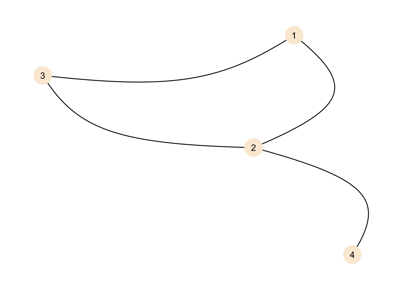
The representation is different, but the graph is the same.
- Nodes do not need to be connected with edges. Even a graph without edges would be perfectly valid. While in our examples there is usually at least one edge connected to each node, this is not a requirement for a graph.
We can create a graph without edges.
no_edges <- tbl_graph(nodes = data.frame(id = 1:5), directed = FALSE)
no_edges
## # A tbl_graph: 5 nodes and 0 edges
## #
## # An unrooted forest with 5 trees
## #
## # Node Data: 5 x 1 (active)
## id
## <int>
## 1 1
## 2 2
## 3 3
## 4 4
## 5 5
## #
## # Edge Data: 0 x 2
## # … with 2 variables: from <int>, to <int>And of course this can be plotted as well:
ggraph(no_edges, layout = "stress") +
    geom_edge_link() +
    geom_node_point(size = 10, colour = "antiquewhite") +
    geom_node_text(aes(label = id)) +
    theme_graph()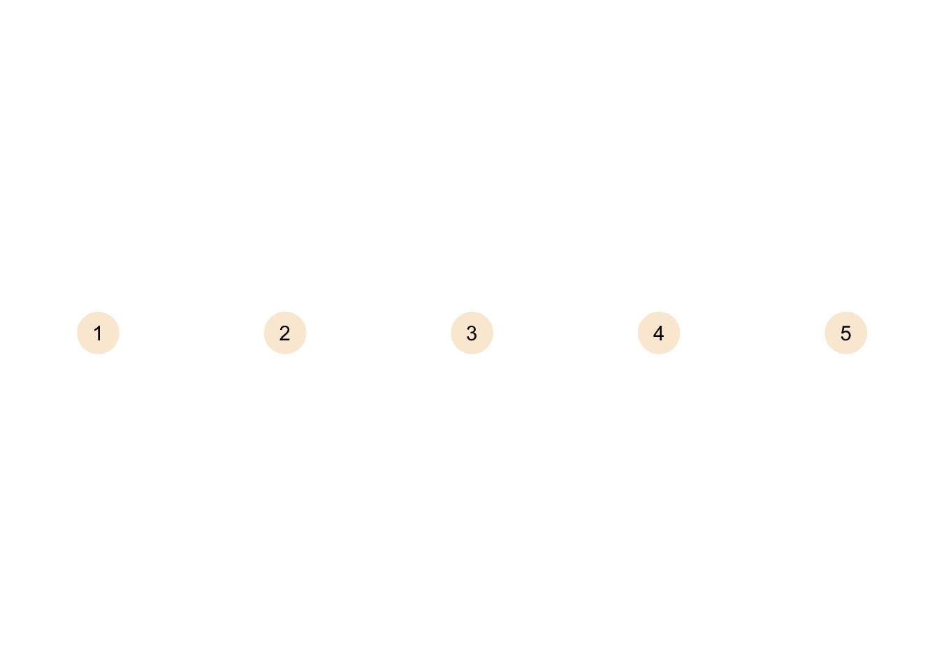
A graph without edges is called an empty graph. In theory you could also have a null graph without nodes and edges (i.e. completely empty), but of course this is more of a theoretical thing.
Size, Order and Degree
Before we begin, let’s plot the graph again, so you don’t have to scroll all the way up.
ggraph(my_graph, layout = "stress") +
    geom_edge_link() +
    geom_node_point(size = 10, colour = "antiquewhite") +
    geom_node_text(aes(label = id)) +
    theme_graph()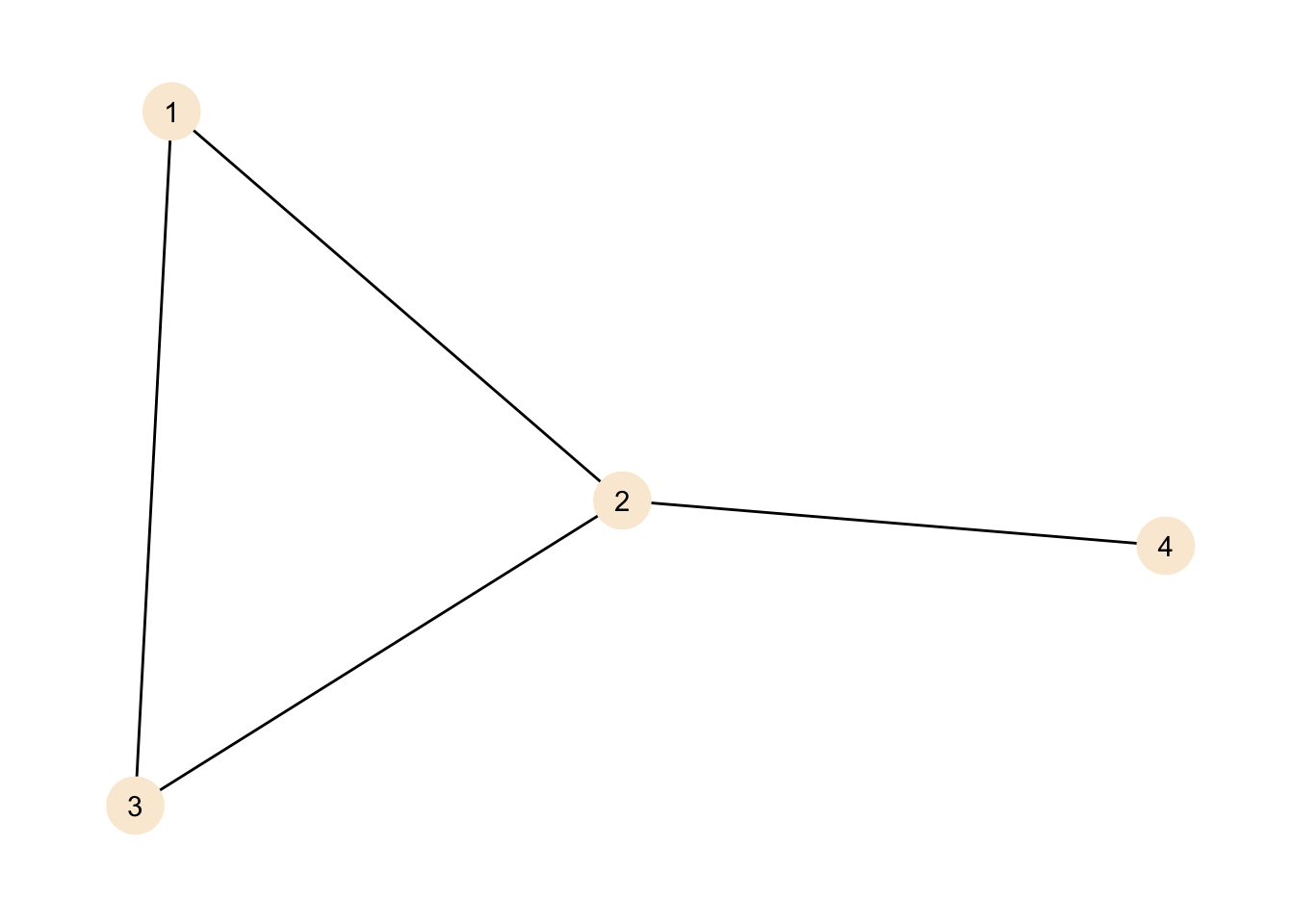
We can describe our graph in different ways. The first thing we can do is look at the size of the graph. The size of the graph is the amount of edges in a graph.
gsize(my_graph)## [1] 4The result is unsurprising as with our small graph we can just count the edges in the plot and end up at the same result.
There is a similar measure relating to the nodes in the graph, this is the order.
gorder(my_graph)## [1] 4For our graph order and size are the same, but unless the network is very sparse you would expect more edges than nodes in a graph.
Another measure we can calculate is the degree of the nodes. The degree gives the amount of connections each node has. Nodes with larger degrees tend to be more important for a network than those with small degrees, but this obviously also depends a bit on your data.
my_graph <- my_graph %>%
    activate("nodes") %>%
    mutate(degree = centrality_degree())

my_graph
## # A tbl_graph: 4 nodes and 4 edges
## #
## # An undirected simple graph with 1 component
## #
## # Node Data: 4 x 2 (active)
## id degree
## <dbl> <dbl>
## 1 1 2
## 2 2 3
## 3 3 2
## 4 4 1
## #
## # Edge Data: 4 x 2
## from to
## <int> <int>
## 1 1 2
## 2 1 3
## 3 2 3
## # … with 1 more rowThere is a new column in the node data giving the degree for each node. As the graph is small we can check against our plot, node 2 has three connections (to 1, 3 and 4), while 1 and 3 have two connections each (to 3 and 2 for 1 and 1 and 2 for 3) and node 4 has just one connection to node 2. As node 4 has a degree of one, it is called a pendant node.
A quick note on the activate("nodes") part of the call. When using tidygraph the
graph has two components: nodes and edges. When you want to apply transformations
on these objects you need to tell tidygraph which one to work on, or in
other words: activate that part.
The part you activate stays activated, but it is the safest option to just
always include activate in your calls.
Making things more intersting: loops and components
Let’s create a slightly more complex graph that introduces new properties.
nodes <- tibble(id = c(1, 2, 3, 4, 5, 6, 7, 8))
edges <- tibble(from = c(1, 4, 2, 4, 4, 6, 6, 7, 7, 7),
                  to = c(2, 4, 3, 2, 1, 5, 8, 8, 6, 5))
my_graph <- tbl_graph(nodes = nodes, edges = edges, directed = FALSE)
my_graph
## # A tbl_graph: 8 nodes and 10 edges
## #
## # An undirected multigraph with 2 components
## #
## # Node Data: 8 x 1 (active)
## id
## <dbl>
## 1 1
## 2 2
## 3 3
## 4 4
## 5 5
## 6 6
## # … with 2 more rows
## #
## # Edge Data: 10 x 2
## from to
## <int> <int>
## 1 1 2
## 2 4 4
## 3 2 3
## # … with 7 more rowsggraph(my_graph, layout = "stress") +
geom_edge_link() +
geom_edge_loop() +
geom_node_point(size = 10, colour = "antiquewhite") +
geom_node_text(aes(label = id)) +
theme_graph()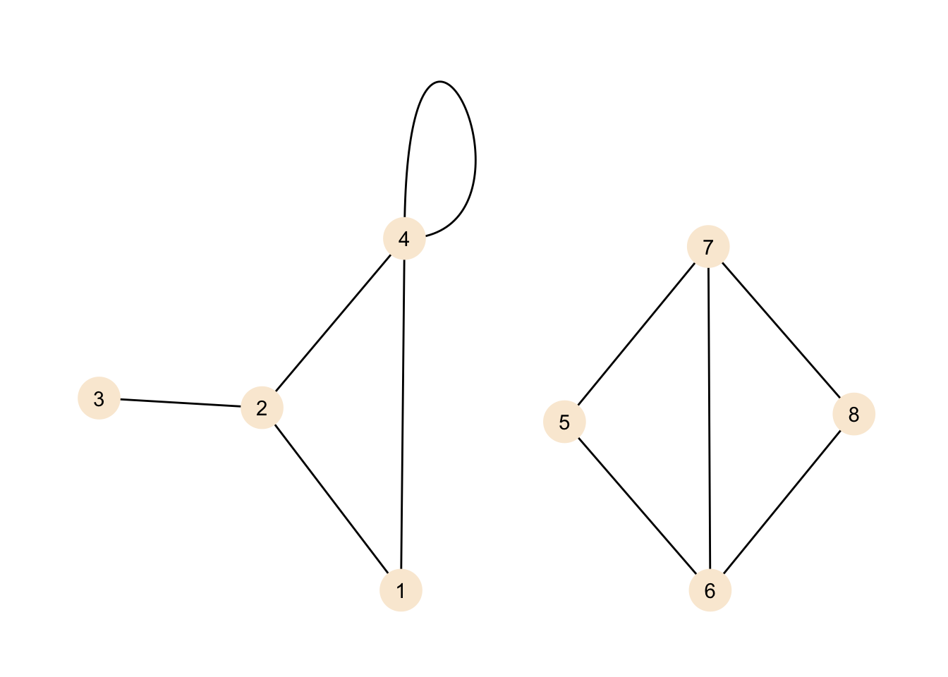
We do see two new features here. If you have never dealt with graphs before you might think that we do see two independent graphs in the plot, but no. Our definition for the graph included all the nodes and edges we do see here, but there does not need to be a path from any given node to any other node. This graph does contain two components. A component is a sub-graph in which nodes are connected, but its nodes do not have connections to outside of the sub-graph. If we introduced an edge, for example, between nodes 1 and 6, then our graph would be a graph with just one component again.
We can add information on which nodes belongs to which component to our
graph data using tidygraph.
my_graph <- my_graph %>%
    activate("nodes") %>%
    mutate(comp = group_components())

my_graph
## # A tbl_graph: 8 nodes and 10 edges
## #
## # An undirected multigraph with 2 components
## #
## # Node Data: 8 x 2 (active)
## id comp
## <dbl> <int>
## 1 1 1
## 2 2 1
## 3 3 1
## 4 4 1
## 5 5 2
## 6 6 2
## # … with 2 more rows
## #
## # Edge Data: 10 x 2
## from to
## <int> <int>
## 1 1 2
## 2 4 4
## 3 2 3
## # … with 7 more rowsNote that we could also call the lower-level function from igraph for the
same information in a different format.
components(my_graph)## $membership
## [1] 1 1 1 1 2 2 2 2
##
## $csize
## [1] 4 4
##
## $no
## [1] 2We can add the new information to our plot.
ggraph(my_graph, layout = "stress") +
    geom_edge_link() +
    geom_edge_loop() +
    geom_node_point(size = 10, aes(colour = as.factor(comp))) +
    geom_node_text(aes(label = id)) +
    theme_graph() +
    labs(colour = "Component")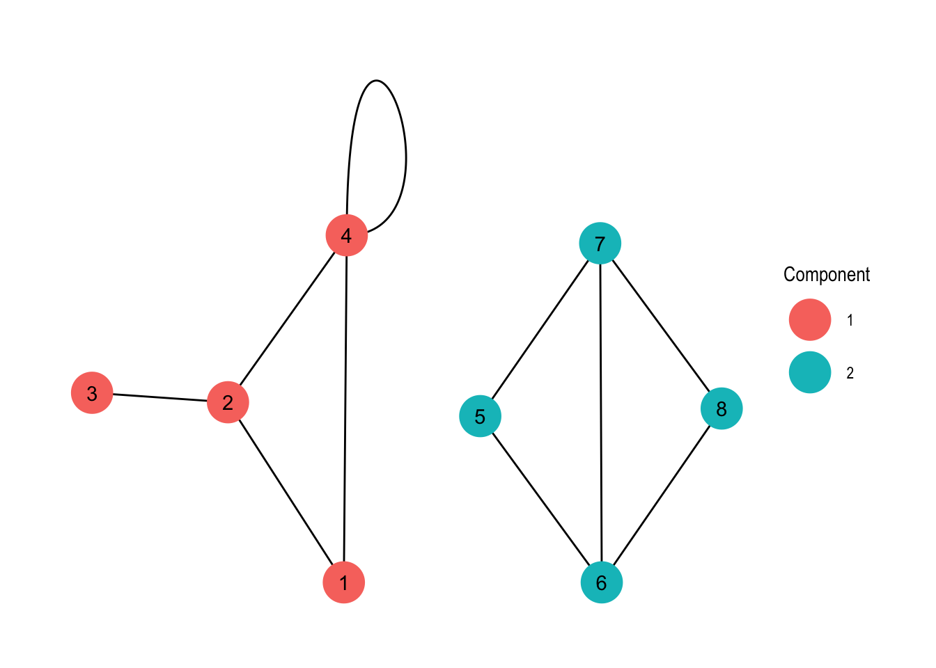
Now we have added some colour to our plot, visualising the sort of obvious components of the graph. Again, with larger graphs this might be more interesting, but this is a tutorial so the examples are on the simpler side of things.
Now, what is the thing at node 4? That’s a loop or in other words an edge that connects the node it originates from with itself. You may ask why is this useful? Well, it depends on your data. For example if you represent transport of goods between locations as a graph, a loop could be the goods that can not be delivered and are returned to their origin.
We can observe a somewhat interesting property when calculating the degree of the node.
my_graph <- my_graph %>%
    activate("nodes") %>%
    mutate(degree = centrality_degree())

my_graph %>%
    activate("nodes") %>%
    as_tibble() %>%
    arrange(desc(degree))
## # A tibble: 8 x 3
## id comp degree
## <dbl> <int> <dbl>
## 1 4 1 4
## 2 2 1 3
## 3 6 2 3
## 4 7 2 3
## 5 1 1 2
## 6 5 2 2
## 7 8 2 2
## 8 3 1 1Wait what? Node number 4 has a degree of four? Well, because it has four connections, hasn’t it? The connections are from 4 to 1, from 4 to 2, from 4 to 4 and from 4 to 4. If you are the node all you know are that there are four edges originating from you, but in case of the loop it is both ends of the same thing. This is the reason why loops do count twice towards the degree of a node.
Weights
Now let’s make up some more interesting data. Assume we are an airline currently serving six airports. We have data on the average amount of monthly passengers on our routes over a year.
airports <- tibble(
    name = c("NRT", "ICN", "HEL", "AMS", "GBE", "ADD"),
    continent = c("Asia", "Asia", "Europe", "Europe", "Africa", "Africa"),
    city = c("Narita", "Incheon", "Helsinki", "Amsterdam",
             "Gaborone", "Addis Abeba"))

flights <- tibble(
    from = c("NRT", "NRT", "NRT", "ICN", "ICN", "HEL",
             "HEL", "AMS", "GBE", "GBE", "ADD"),
    to =   c("ICN", "HEL", "AMS", "HEL", "GBE", "AMS",
             "ADD", "ADD", "ADD", "HEL", "NRT"),
    passengers = c(1800, 2100, 900, 1550, 1300, 2450, 1650, 2900, 1100,
                   2100, 1700)
)

aviation <- tbl_graph(nodes = airports,
                      edges = flights, directed = FALSE)
Note also that we have defined the connections based on their name. This is a bit of a mixed-bag: is is definitely much nicer working with names than with numbers in many contexts, but with tidygraph you need to do some extra work to convert the names back to numbers in some cases.
Now the thing that is new is that our edges have weights. Previously our edges were either present or absent, now they can convey even more information. When giving it some thought you can do a lot of things this way. Assume for example that our nodes are street crossings and our edge weights are distances. We could then build a navigation system on top of this (I might do something like that in a future post, this sounds like it could be quite fun).
ggraph(aviation, layout = "stress") +
    geom_edge_link(aes(edge_alpha = passengers), width = 2) +
    geom_node_point(colour = "blue", size = 4)+
    geom_node_label(aes(label = name), nudge_y = 0.1, nudge_x = -0.1) +
    theme_graph() +
    labs(edge_alpha = "Passengers")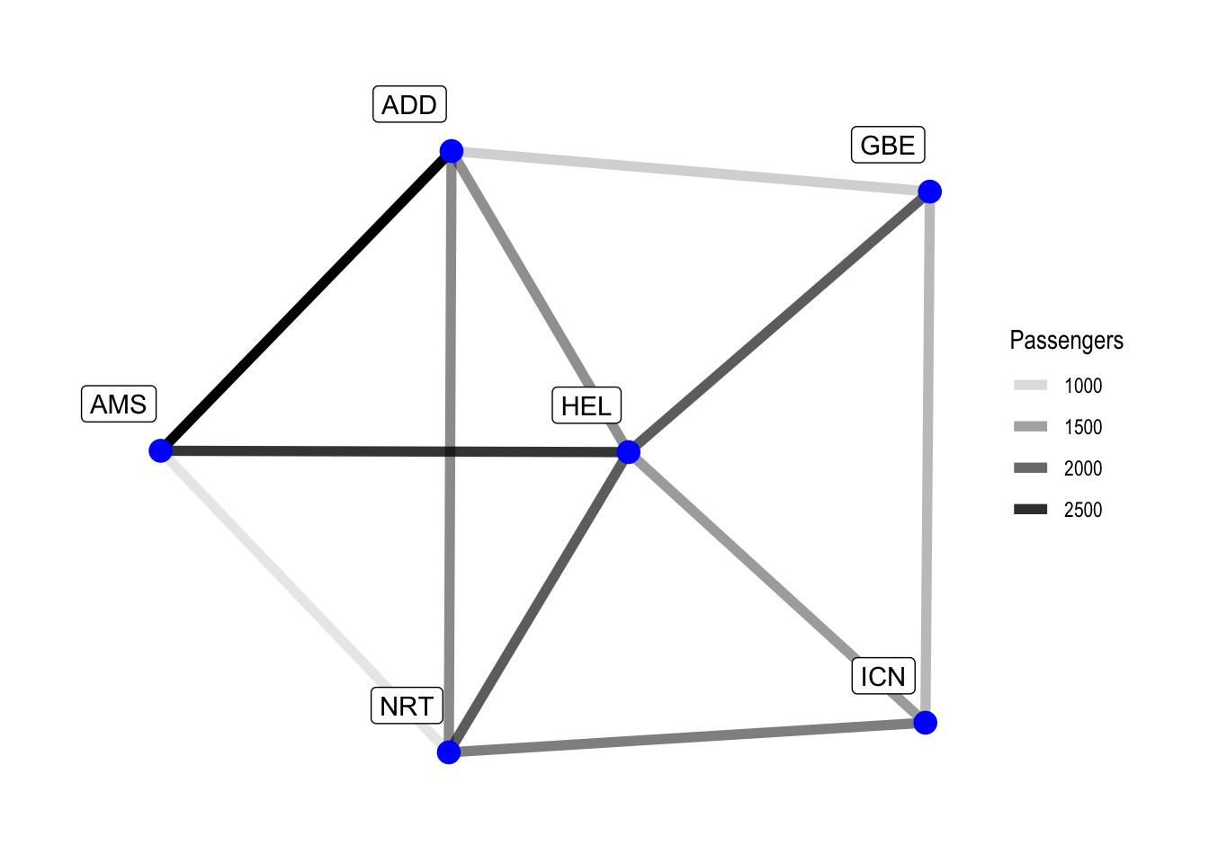
While the central airport in our network is kind of obvious, we can nonetheless improve our visualisation by adding the nodal degree.
aviation <- aviation %>%
    activate(nodes) %>%
    mutate(degree = centrality_degree())

ggraph(aviation, layout = "stress") +
    geom_edge_link(aes(edge_alpha = passengers), width = 2) +
    geom_node_point(aes(size = degree), colour = "blue") +
    geom_node_label(aes(label = name), nudge_y = 0.1, nudge_x = -0.1) +
    scale_size(breaks = seq(3, 5, 1)) +
    theme_graph() +
    labs(edge_alpha = "Passengers", size = "Connections")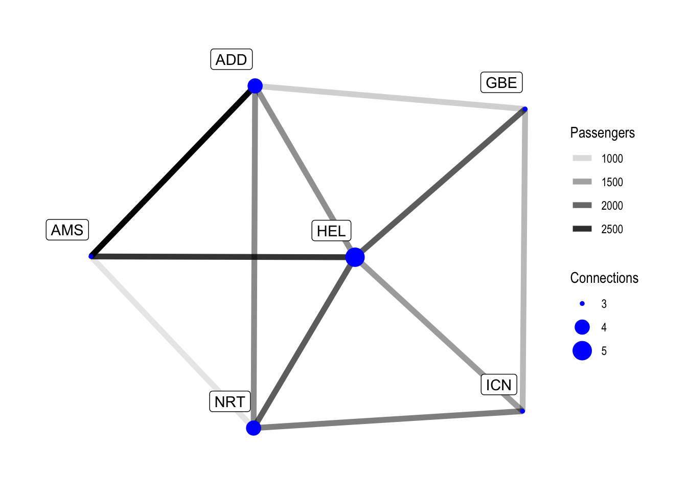
Our data is pretty tame and in a future post we will look at some bigger datasets. HEL is the best-connected airport in our example, but removing it would not change anything regarding the amount of transfers required between the remaining destinations, as our network is really small. With larger data there are of course better ways to determine which nodes are important for the network, but this is for a future post.
Of course we can also find the best-connected airport by looking directly at the data.
aviation %>%
    activate(nodes) %>%
    as_tibble() %>%
    arrange(desc(degree))
## # A tibble: 6 x 4
## name continent city degree
## <chr> <chr> <chr> <dbl>
## 1 HEL Europe Helsinki 5
## 2 NRT Asia Narita 4
## 3 ADD Africa Addis Abeba 4
## 4 ICN Asia Incheon 3
## 5 AMS Europe Amsterdam 3
## 6 GBE Africa Gaborone 3As the plot already indicates Helsinki is our most important airport for our network, followed by Narita and Addis Abeba.
Now, we can ask our graph some more questions. For example, in our network, what would be the most popular route going from Addis Abeba to Incheon (this refers to the popularity of the legs of the route, with the information we have available we do not know whether people transfer at the airports). This does not consider travel times, only what would be the most popular route.
aviation <- aviation %>%
  morph(to_shortest_path,
        which(.N()$name == "ADD"), which(.N()$name == "ICN"),
        weights = 1 / passengers) %>%
  activate("edges") %>%
  mutate(ADD_ICN_most_popular = "y") %>%
  unmorph()

ggraph(aviation, layout = "stress") +
    geom_edge_link(aes(edge_alpha = passengers,
                       edge_colour = ADD_ICN_most_popular), width = 2) +
    geom_node_point(aes(size = degree), colour = "blue") +
    geom_node_label(aes(label = name), nudge_y = 0.1, nudge_x = -0.1) +
    scale_size(breaks = seq(3, 5, 1)) +
    scale_edge_color_manual(values = c("y" = "orangered"), na.value = "black") +
    theme_graph() +
    guides(edge_colour = FALSE) +
    labs(edge_alpha = "Passengers",
         size = "Connections",
         title = "Aviation Network",
         subtitle = "Most popular shortest route between ADD and ICN in red.")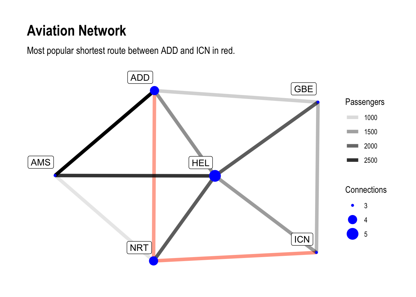
There are a few things in here.
First we morphed our graph.
In tidygraph morphing means to temporarily transform or subset the graph based
on a feature or metric.
That feature is given by a
morphing function,
in our case it is to_shortest_path.
The morphing function here needs some input, that is given apply-style in the
morph call.
First we need to define two nodes between which we want to find the shortest
path.
The function expects two numbers, but we would like to work with names.
This is why we need a bit of a workaround.
With the .N() function we can access node data inside of tidygraph verbs,
so .N()$name returns all the names of the nodes.
We can then match this against the desired name, and by wrapping this in a
call to which it returns the index of the match.
This is clunky, but it gets the job done here.
Second, we define weights based upon which the shortest path is found.
Here we use 1 / passengers, because the shortest path is the one with the
least weight.
Without dividing 1 by passengers we would of course get the least popular
route here.
We are left with a sub-graph now we can manipulate.
In our case we add an attribute to the edges which we can later use for
plotting.
Once we have finished our business with the sub-graph, we return to the full
graph again with unmorph, but the full graph now contains the modifications
we made to our sub-graph.
In our plot we add another aesthetic to the geom_edge_link call and
also manually define the colours for the affected edges so we see the
most popular possible shortest path between Addis Abeba and Incheon in
all it’s glory.
Of course this did not take travel time or number of transfers into consideration.
I hope at this points ideas start to from in your head how one could apply this to larger datasets, for example to look for flights.
Directed Graphs
Finally, let’s have a look at directed graphs. I do not want this tutorial to be too long so hopefully there will be more graph related tutorials in the future, but not at least briefly touching upon directed graphs would be a huge omission.
So far, all our graphs were undirected. There were connections between nodes, but a connection between A and B with weight Z implied a connection between B and A with the same weight. Of course it would be a rather big limitation if there was no possibility to express differences in the directions.
We can make up some simple data again.
nodes <- tibble(id = c(1, 2, 3, 4, 5, 6, 7, 8))
edges <- tibble(from = c(1, 1, 2, 2, 3, 3, 4, 5, 5, 6, 6, 6, 7, 7, 8, 8, 8),
                to =   c(2, 7, 3, 6, 1, 5, 5, 2, 8, 1, 3, 8, 2, 4, 1, 6, 7))
my_directed_graph <- tbl_graph(nodes = nodes, edges = edges, directed = TRUE)
my_directed_graph
## # A tbl_graph: 8 nodes and 17 edges
## #
## # A directed simple graph with 1 component
## #
## # Node Data: 8 x 1 (active)
## id
## <dbl>
## 1 1
## 2 2
## 3 3
## 4 4
## 5 5
## 6 6
## # … with 2 more rows
## #
## # Edge Data: 17 x 2
## from to
## <int> <int>
## 1 1 2
## 2 1 7
## 3 2 3
## # … with 14 more rowsggraph(my_directed_graph, layout = "stress") +
geom_edge_link(arrow = arrow(length = unit(3, "mm")),
start_cap = circle(3, "mm"),
end_cap = circle(3, "mm")) +
geom_node_point(colour = "antiquewhite", size = 6) +
geom_node_text(aes(label = id)) +
theme_graph()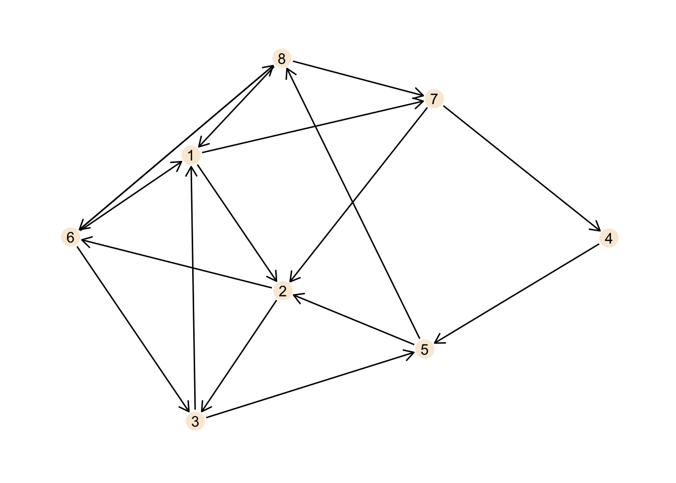
This is certainly not the best plot ever, but it should illustrate the
network well enough.
Note the definitions for the arrow indicating the direction of the
connections as well as the spacing established using start_cap and end_cap.
The same basic metrics as above also work for directed graphs.
gsize(my_directed_graph)## [1] 17gorder(my_directed_graph)## [1] 8From the plot it is obvious that there is just one component, but nonetheless:
components(my_directed_graph)## $membership
## [1] 1 1 1 1 1 1 1 1
##
## $csize
## [1] 8
##
## $no
## [1] 1We can also calculate the degree for the nodes, but now we have two types of degree: in-degree and out-degree, giving the amount of incoming and outgoing connections respectively.
my_directed_graph <- my_directed_graph %>%
  activate("nodes") %>%
  mutate(in_degree = centrality_degree(mode = "in"),
         out_degree = centrality_degree(mode = "out"))

my_directed_graph
## # A tbl_graph: 8 nodes and 17 edges
## #
## # A directed simple graph with 1 component
## #
## # Node Data: 8 x 3 (active)
## id in_degree out_degree
## <dbl> <dbl> <dbl>
## 1 1 3 2
## 2 2 3 2
## 3 3 2 2
## 4 4 1 1
## 5 5 2 2
## 6 6 2 3
## # … with 2 more rows
## #
## # Edge Data: 17 x 2
## from to
## <int> <int>
## 1 1 2
## 2 1 7
## 3 2 3
## # … with 14 more rowsWe can clearly see that the numbers are different for in and out, which makes sense as there is a different amount of incoming and outgoing connections for each node.
ggraph(my_directed_graph, layout = "stress") +
    geom_edge_link(arrow = arrow(length = unit(3, "mm")),
                  start_cap = circle(3, "mm"),
                  end_cap = circle(3, "mm")) +
    geom_node_point(size = 6, aes(colour = in_degree)) +
    scale_colour_gradient(low = "antiquewhite", high = "orangered",
                          breaks = seq(0, 4, 1)) +
    geom_node_text(aes(label = id)) +
    labs(title = "In-Degree of a Directed Graph", colour = "in-degree") +
    theme_graph()
ggraph(my_directed_graph, layout = "stress") +
    geom_edge_link(arrow = arrow(length = unit(3, "mm")),
                  start_cap = circle(3, "mm"),
                  end_cap = circle(3, "mm")) +
    geom_node_point(size = 6, aes(colour = out_degree)) +
    scale_colour_gradient(low = "antiquewhite", high = "skyblue",
                          breaks = seq(0, 4, 1)) +
    geom_node_text(aes(label = id)) +
    labs(title = "Out-Degree of a Directed Graph", colour = "out-degree") +
    theme_graph()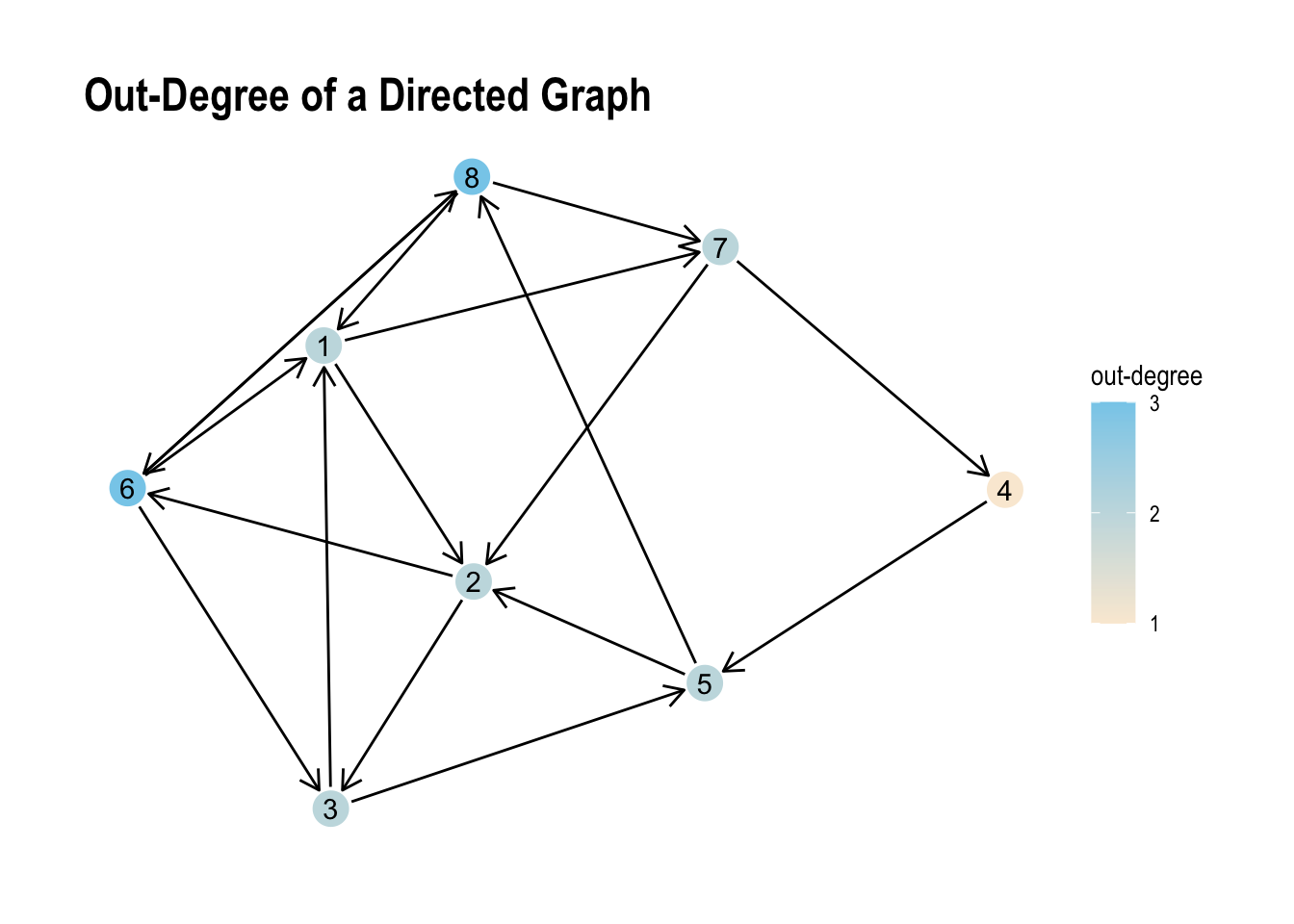
Albeit the small range of values the visual representation we can see the unsurprising differences between both values pretty well.
Cyclic and Acyclic graphs
Our directed graph above is a cyclic graph. A cyclic graph does contain at least one path from a node back to itself.
Let’s create a simple example.
nodes <- tibble(id = c(1, 2, 3, 4, 5))
edges <- tibble(from = c(1, 2, 2, 3, 4),
                  to = c(2, 3, 5, 1, 2))
cyclic_graph <- tbl_graph(nodes = nodes, edges = edges, directed = TRUE)

ggraph(cyclic_graph, layout = "stress") +
    geom_edge_link(arrow = arrow(length = unit(3, "mm")),
                   start_cap = circle(3, "mm"),
                   end_cap = circle(3, "mm")) +
    geom_node_point(size = 6, colour = "antiquewhite") +
    geom_node_text(aes(label = id)) +
    theme_graph()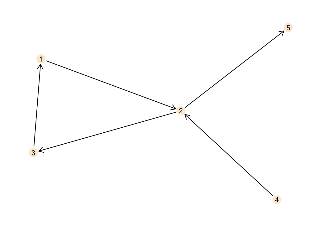
When we start at node 1 we can move along the edge to route 2, then to node 3 and from there back to node 1. Thus, there is a cycle in our graph and this makes our graph cyclic.
The direction we move in is determined by the direction of the edge. We can not move directly from node 2 to node 1 for example, as the edge connecting both nodes points from node 1 to node 2, but not vice versa.
nodes <- tibble(id = c(1, 2, 3, 4, 5))
edges <- tibble(from = c(1, 1, 2, 2, 3, 4),
                  to = c(2, 3, 3, 5, 5, 2))
acyclic_graph <- tbl_graph(nodes = nodes, edges = edges, directed = TRUE)

ggraph(acyclic_graph, layout = "stress") +
    geom_edge_link(arrow = arrow(length = unit(3, "mm")),
                   start_cap = circle(3, "mm"),
                   end_cap = circle(3, "mm")) +
    geom_node_point(size = 6, colour = "antiquewhite") +
    geom_node_text(aes(label = id)) +
    theme_graph()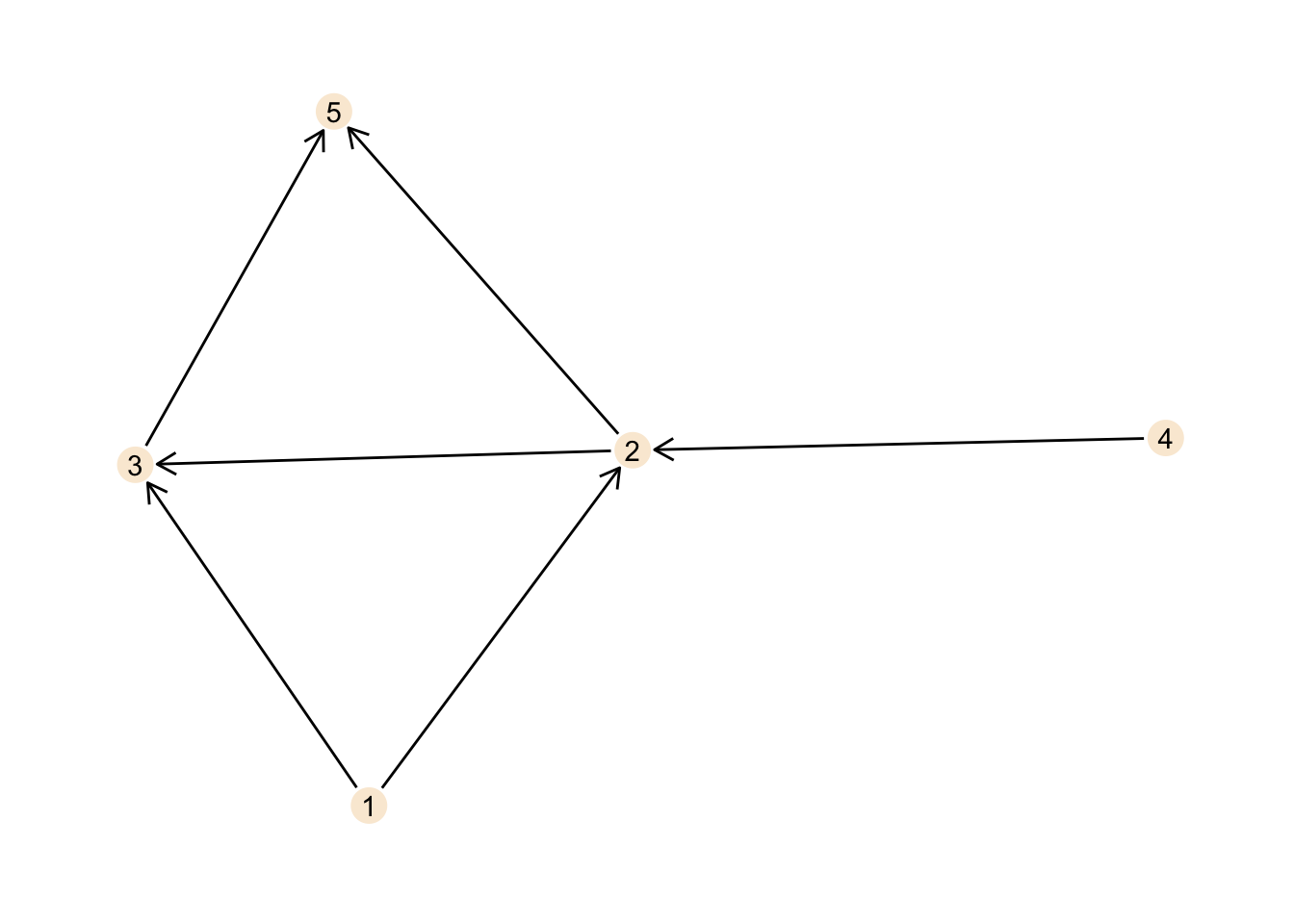
This graph is acyclic. No matter where you start, following the directed edges, you can never reach your starting point again.
Now, for small graphs this can be found with visual inspection of the
graph, but obviously this does not scale well to larger graphs.
Fortunately there is the is_dag function in igraph telling us whether a
graph is cyclic or not.
The acronym dag here stands for directed acyclic graph so it should return
TRUE for the acyclic graph.
is_dag(cyclic_graph)## [1] FALSEis_dag(acyclic_graph)## [1] TRUEConclusions
Although, this post seems like a pretty brief introduction, we did cover
quite a few points and concepts about graphs.
Software-wise we got a good idea of how to work with tidygraph,
ggraph and to a more minor extent also igraph.
If you are familiar with graphs this is not much, but when getting started with graphs this kind of stuff are the foundations you build more complex work on.
As I like graphs quite a bit and find them an interesting and fun topic, I will likely write more on graphs soon. As mentioned above, building a navigation system with graphs sounds like a fun little project. To be honest I have no idea how navigation systems are actually implemented, but using graphs sounds like an interesting first idea. But before that there will probably be at least another tutorial on graph topics.