Statistics, Science, Random Ramblings
A blog about data and other interesting things
Nicer density plots with ggplot2
Visualising density of a variable is a common and useful step of exploring
data.
There is a geom_density() in ggplot2 that allows for straightforward
visualisation of density, but without much effort the appearance of the
plot can be improved.
Let’s use the faithful data.
It contains the duration of eruptions of a geyser and the time
between eruptions, both in minutes.
library("ggplot2")
library("tibble")
data("faithful")
faithful <- as_tibble(faithful)
faithful
## # A tibble: 272 x 2
## eruptions waiting
## <dbl> <dbl>
## 1 3.6 79
## 2 1.8 54
## 3 3.33 74
## 4 2.28 62
## 5 4.53 85
## 6 2.88 55
## 7 4.7 88
## 8 3.6 85
## 9 1.95 51
## 10 4.35 85
## # … with 262 more rowsAnd now visualise the density of the waiting variable:
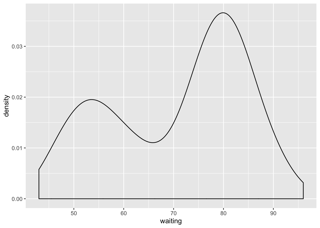
plot_base <- ggplot(faithful) + aes(x = waiting)
plot_base + geom_density()
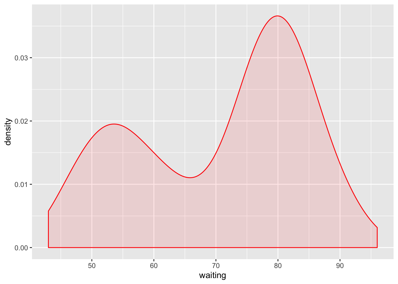
This gets the job done, but you might want to add some colour:
plot_base + geom_density(fill = "red", alpha = .1, colour = "red")
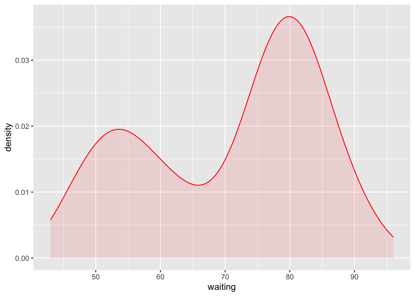
To be honest, I am not really a fan of the connected line at the bottom and the side (although the vertical lines at the sides are technically correct).
By looking under the hood we can see how the density is calculated in ggplot2 and how it is plotted.
So, we can implement something similar:
dens <- density(faithful$waiting, from = min(faithful$waiting),
                to = max(faithful$waiting))
dens_tbl <- tibble(x = dens$x, y = dens$y)
ggplot(dens_tbl) +
    aes(x = x, y = y) +
    geom_area(fill = "red", alpha = .1) +
    geom_line(colour = "red") +
    labs(x = "waiting", y = "density")
This could easily be put inside of a function or defined as a custom geom to
use with ggplot2.
Concluding remarks
Building an alternative to the default density plot of ggplot2 is easy.
Looking at the source of you favourite function can be useful and allows you
to build upon what is included in a package.