Statistics, Science, Random Ramblings
A blog about data and other interesting things
Things learnt from participating in Tidy Tuesday for a month
If you at least semi-regularly browse #rstats twitter you may have come across #TidyTuesday including its numerous visualisations of data of all sorts.
What is this all about?
Tidy Tuesday is a weekly project hosted by the R4DS Online Learning Community. Each Monday evening (in my time zone) a new data set appears on the corresponding Github page. The goal is then to practice data wrangling and to create a visualisation and post it somewhere online for others to see.
Everyone can participate in this weekly event regardless of being a member of the R4DS Online Learning Community or your experience with R. In fact, I am not a member of that community and have been using R for about a decade and I found it rather valuable to participate.
Due to the fact that there is a new data set each week the first thing that made participation really worthwhile for me was challenging yourself with data you might not have looked at otherwise. Data for Tidy Tuesday comes from a variety of sources and so the chances are high that it might be outside of your usual interests.
Additionally, when you actively follow #TidyTuesday you see a lot of great visualisations that often come with the code to create them. This way you will discover new themes, packages and ways to visualise and handle data that you might not have thought of yourself.
Finally, there are usually less than 24 hours between the dataset being posted and the peak of activity with #TidyTuesday. Thus, you do not have that much time to come up with something. This forces you to make compromises and to not fall into a deep rabbit hole of perfectionism, which is something I personally am very prone to.
In fact, some of the outcomes I have produced are definitely in need of further work, but as long as one is aware of that, it is probably not too bad? My personal goal is to not spend more than 90 minutes on each data set, which lead to some of the results I created being a bit half-baked. Still working with the data and trying to come up with a visualisation was still a useful experience.
Learning things
So, what have I learnt? By going through the code I could compile quite a list of countable things:
Packages
hrbrthemes– A nice collection of ggplot2 themes.waffle– Waffle plots for ggplot2, although I have not actively used it, I became aware of it through others’ visualisations and plan to use it for a future data visualisation project.
Functions
dplyr::top_n– A nice way to avoid constructions ofarrange() %>% slice().tidytext::reorder_within(and friends) – Modify factors for rearranging them inside of ggplot2 facets.base::format– How I never came across this before is beyond me and it does exactly what you expect: formatting things, typically numbers.cowplot::ggdraw– Can be used to colour the graphics device, which is incredibly useful when having a plot on a dark background.
Misc
- The IBM Plex Sans font, which looks pretty nice. The
hrbrthemespackage provides tools to install it. - The
nrowargument toggplot2::guide_legend, specifying the number of rows a ggplot2 legend has. Similar toformatI am quite surprised that I only learned about it recently.
Beyond this list, it is nonetheless the most important thing to regularly move outside of your comfort zone and force yourself to try to create something potentially interesting within a short time frame, out of some data you might never have explored otherwise. Sometimes you will not be happy with whatever you created, fortunately no one will rip you apart for it; at the end of the day making mistakes, even in public, is crucial for learning things.
Some visualisations
To wrap things up and to not end a post about visualisations without showing any of those, below is some output generated as part of Tidy Tuesday. The full code for all visualisations is on my Gitlab page.
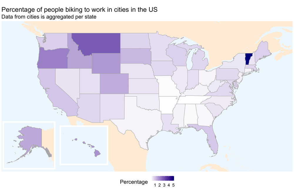
The first one shows the percentage of people who commute by bike per US
state.
The original data was supplemented with map data from the rnaturalearth
package, with the two sub-maps inserted using ggplot2::annotation_custom.
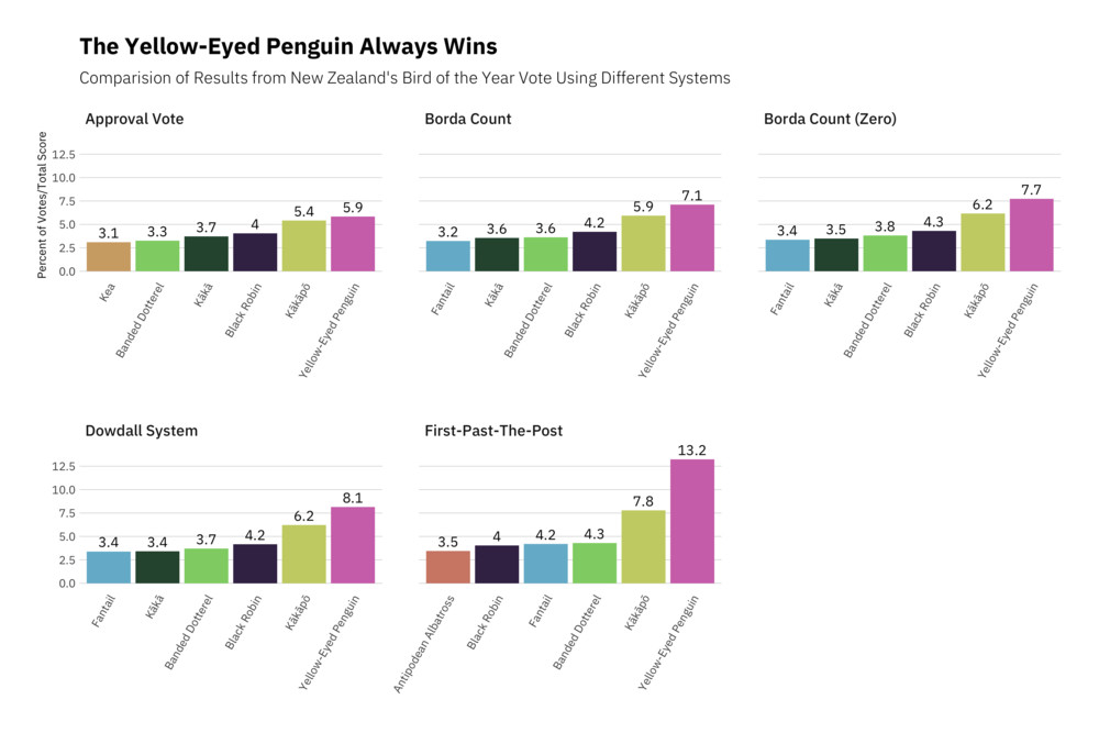
 The second one I am including here shows the results form the New Zealand Bird
of the Year vote using different voting systems. Here, reordering within
facets turned out to be very useful to have the birds in order of the
voting results. I have adapted this plot a bit for the smaller size on this
website compared to the original version.
The second one I am including here shows the results form the New Zealand Bird
of the Year vote using different voting systems. Here, reordering within
facets turned out to be very useful to have the birds in order of the
voting results. I have adapted this plot a bit for the smaller size on this
website compared to the original version.
Conclusions
Challenging yourself to move out of your comfort zone potentially has great benefit, as you likely will learn a lot of things while doing so. Participating in #TidyTuesday to practice your R skills regardless of your experience with the language is a low-threshold way of getting your hands dirty with some data and learn from it.