Statistics, Science, Random Ramblings
A blog about data and other interesting things
Visualising climate data for my city
Considering all we know, climate change is very real and a threat and challenge for us all. Being a data-person, I was interested in which data on climate is openly available for my city – Düsseldorf, Germany – and the patterns visible in it.
The German Weather Agency (Deutscher Wetterdienst), the DWD, has easily available historical data since 1970 for the city of Düsseldorf on its webiste (while the DWD has an English website, I cannot find the corresponding English page). Unfortunately there is not licence attached, so I will not re-share the data.
My goal was to summarise and plot the data. There are two files: one with historical data form 1970 to 2018, and one with current data from 2018 to today. We read both and combine the partially overlapping data sets.
Data wrangling
First we read the data and load the essential libraries we are going to use.
library("dplyr")
library("ggplot2")
library("lubridate")
library("patchwork")
dclimate <- readr::read_delim(
    "produkt_klima_tag_19690701_20181231_01078.txt",
    delim = ";", trim_ws = TRUE)
dclimate_current <- readr::read_delim(
    "produkt_klima_tag_20180726_20200126_01078.txt",
    delim = ";", trim_ws = TRUE)
Let’s have a look at it:
glimpse(dclimate_current)## Observations: 550
## Variables: 19
## $ STATIONS_ID <dbl> 1078, 1078, 1078, 1078, 1078, 1078, 1078, 1078, 1078…
## $ MESS_DATUM <dbl> 20180726, 20180727, 20180728, 20180729, 20180730, 20…
## $ QN_3 <dbl> 10, 10, 10, 10, 10, 10, 10, 10, 10, 10, 10, 10, 10, …
## $ FX <dbl> 11.3, 10.3, 13.7, 14.9, 9.3, 12.7, 8.2, 7.2, 7.7, 11…
## $ FM <dbl> 2.4, 3.1, 4.4, 4.3, 2.7, 3.7, 3.0, 2.2, 2.4, 3.9, 3.…
## $ QN_4 <dbl> 3, 3, 3, 3, 3, 3, 3, 3, 3, 3, 3, 3, 3, 3, 3, 3, 3, 3…
## $ RSK <dbl> 0.0, 0.0, 2.3, 0.0, 0.0, 0.0, 0.0, 0.0, 0.0, 0.0, 0.…
## $ RSKF <dbl> 0, 0, 6, 0, 0, 0, 0, 0, 0, 0, 0, 0, 6, 0, 6, 6, 0, 6…
## $ SDK <dbl> 7.850, 14.350, 5.783, 3.783, 10.600, 10.850, 6.967, …
## $ SHK_TAG <dbl> 0, 0, 0, 0, 0, 0, 0, 0, 0, 0, 0, 0, 0, 0, 0, 0, 0, 0…
## $ NM <dbl> 2.9, 0.9, 4.1, 6.6, 4.3, 4.3, 4.3, 1.3, 0.7, 4.8, 2.…
## $ VPM <dbl> 16.6, 12.7, 16.1, 13.2, 15.0, 17.0, 14.8, 15.0, 15.9…
## $ PM <dbl> 1009.29, 1006.37, 1004.21, 1008.31, 1009.78, 1011.89…
## $ TMK <dbl> 28.1, 29.5, 24.6, 24.2, 26.7, 25.4, 24.1, 25.6, 27.7…
## $ UPM <dbl> 48.46, 32.96, 52.33, 46.13, 45.21, 54.75, 50.92, 49.…
## $ TXK <dbl> 36.5, 36.4, 29.6, 30.7, 34.2, 31.7, 29.8, 33.2, 35.5…
## $ TNK <dbl> 18.5, 19.9, 17.1, 17.2, 18.7, 18.8, 17.3, 15.3, 17.8…
## $ TGK <dbl> 16.5, 15.9, 15.3, 16.4, 16.5, 16.6, 14.8, 13.0, 15.7…
## $ eor <chr> "eor", "eor", "eor", "eor", "eor", "eor", "eor", "eo…Before creating summaries and visualisations, let’s go over the variables first:
- STATIONS_ID: A code to identify the weather station, here 1078 for the station at Düsseldorf’s airport
- MESS_DATUM: German for date of measurement
- FM, FX: Mean and maximum wind speed in m/s.
- QN_3, QN_4: These are not documented as far as I can see and only contain the values 1, 3, 5 and 10.
- RSK, RSKF: Precipitation amount in mm and type of precipitation as numeric value.
- SDK: Hours of sunshine.
- SHK_TAG: Amount of snow in cm.
- TGK: Mean temperature just above the ground (5cm)
- TNK, TXK: Lowest and highest air temperature (2m above ground)
- TMK: Mean temperature for the day (this is not mentioned explicitly in the documentation, but it seems safe to assume that this is 2m above the ground)
- UPM: relative humidity in %
- PM, VPM: air and steam pressure in hpa
- eor: undocumented, but seems to be something like end of record
Now we can bind both datasets together.
They have the same structure, so this is easy, but there is one minor issue:
the data partially overlaps so we call dplyr::distinct on the data column
keeping only one observation per day.
dclimate <- dclimate %>%
    bind_rows(dclimate_current) %>%
    distinct(MESS_DATUM, .keep_all = TRUE)
Next we turn the column names to lower case, as this is easier to handle:
colnames(dclimate) <- tolower(colnames(dclimate))Finally we turn the date into actual dates and then extract year and month into their own columns for easy handling. Further, we remove data for 2020 and 1969 as both years are incomplete in the data.
dclimate <- dclimate %>%
    mutate(mess_datum = ymd(mess_datum)) %>%
    mutate(year = year(mess_datum), month = month(mess_datum)) %>%
    filter(year != 2020 & year != 1969)
The data does not look much different now compared to the start.
glimpse(dclimate)## Observations: 18,262
## Variables: 21
## $ stations_id <dbl> 1078, 1078, 1078, 1078, 1078, 1078, 1078, 1078, 1078…
## $ mess_datum <date> 1970-01-01, 1970-01-02, 1970-01-03, 1970-01-04, 197…
## $ qn_3 <dbl> 5, 5, 5, 5, 5, 5, 5, 5, 5, 5, 5, 5, 5, 5, 5, 5, 5, 5…
## $ fx <dbl> 7.0, 11.8, 11.0, 7.0, 6.8, 10.0, 11.8, 16.7, 17.9, 1…
## $ fm <dbl> 3.2, 5.9, 4.7, 1.7, 3.3, 5.6, 3.3, 5.4, 9.3, 7.5, 5.…
## $ qn_4 <dbl> 5, 5, 5, 5, 5, 5, 5, 5, 5, 5, 5, 5, 5, 5, 5, 5, 5, 5…
## $ rsk <dbl> 0.3, 2.1, 5.6, 0.0, 0.5, 2.1, 0.0, 7.6, 0.8, 0.6, 1.…
## $ rskf <dbl> 7, 8, 8, 0, 7, 7, 0, 8, 1, 1, 1, 0, 1, 1, 1, 1, 1, 0…
## $ sdk <dbl> 0.0, 0.0, 0.0, 0.0, 0.0, 3.8, 1.0, 0.2, 1.2, 0.0, 0.…
## $ shk_tag <dbl> 0, 0, 0, 2, 1, 1, 2, 2, 3, 2, 0, 0, 0, 0, 0, 0, 0, 0…
## $ nm <dbl> 8.0, 8.0, 8.0, 5.7, 7.3, 7.0, 4.7, 5.7, 5.7, 5.7, 6.…
## $ vpm <dbl> 2.7, 5.1, 6.1, 4.7, 4.4, 4.9, 5.1, 3.6, 5.3, 6.5, 6.…
## $ pm <dbl> 1001.2, 997.0, 994.7, 995.1, 989.9, 999.0, 1012.7, 1…
## $ tmk <dbl> -8.9, -0.6, 0.7, -3.4, -2.2, 0.1, -1.4, -1.5, 1.7, 3…
## $ upm <dbl> 85, 89, 94, 95, 85, 81, 89, 68, 80, 84, 72, 77, 77, …
## $ txk <dbl> -7.8, 1.5, 2.4, 0.3, -1.3, 1.7, 1.0, 0.0, 2.7, 3.6, …
## $ tnk <dbl> -9.1, -9.2, 0.0, -4.6, -4.8, -1.9, -5.0, -7.4, -1.5,…
## $ tgk <dbl> -9.0, -10.5, 0.2, -8.4, -5.2, -3.6, -1.1, -13.2, -2.…
## $ eor <chr> "eor", "eor", "eor", "eor", "eor", "eor", "eor", "eo…
## $ year <dbl> 1970, 1970, 1970, 1970, 1970, 1970, 1970, 1970, 1970…
## $ month <dbl> 1, 1, 1, 1, 1, 1, 1, 1, 1, 1, 1, 1, 1, 1, 1, 1, 1, 1…Finally, let’s have a look at the data we will be working with, to check whether it looks clean. We are going to be interested in temperature and precipitation data.
range(dclimate$tmk)## [1] -14.6 31.2range(dclimate$tnk)## [1] -20.8 24.9range(dclimate$txk)## [1] -10.9 40.7range(dclimate$rsk)## [1] 0.0 57.4The ranges look fine (missing values in the data are represented as -999), but also have a quick look at histograms as well.
dclimate %>%
select(tmk, tnk, txk, rsk) %>%
tidyr::pivot_longer(everything()) %>%
ggplot() +
aes(x = value) +
geom_histogram(binwidth = 3) +
facet_wrap(name~., scales = "free")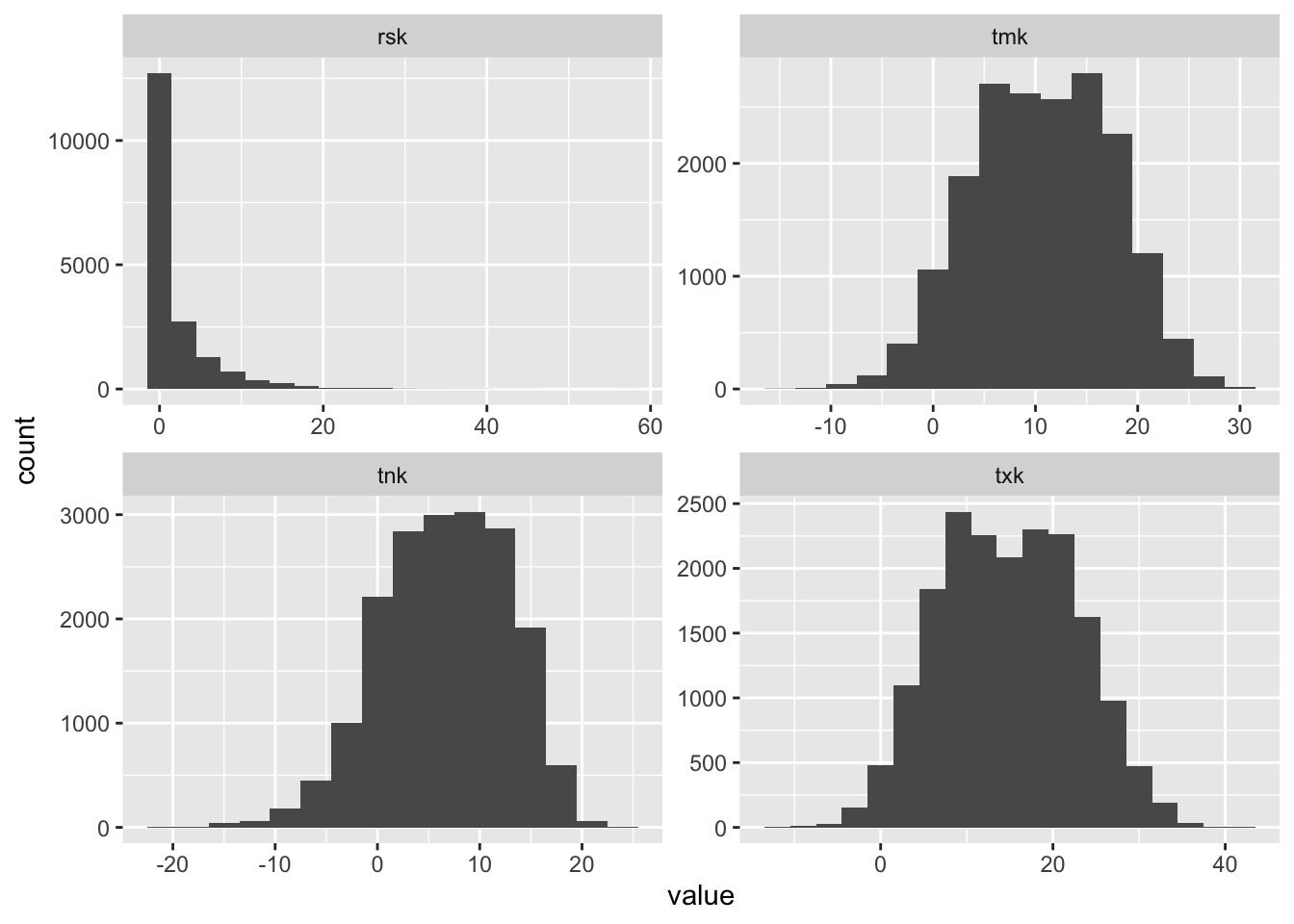 The distribution of data does not look like there are obvious issues.
So, let’s proceed.
The distribution of data does not look like there are obvious issues.
So, let’s proceed.
Summarising data
When looking at changes in temperature over time it is common to relate the average values of a period of time to a baseline values and look at the difference.
baseline <- dclimate %>%
    filter(year >= 1970 & year < 1980) %>%
    group_by(month) %>%
    summarise(bl_mean = mean(tmk)) %>%
    ungroup()

baseline
## # A tibble: 12 x 2
## month bl_mean
## <dbl> <dbl>
## 1 1 3.05
## 2 2 3.48
## 3 3 5.73
## 4 4 8.39
## 5 5 13.5
## 6 6 16.8
## 7 7 18.2
## 8 8 18.0
## 9 9 14.6
## 10 10 10.6
## 11 11 6.56
## 12 12 4.20So, the above values are the daily mean temperatures averaged by month in the 1970s in the city of Düsseldorf. We now calculate the difference to these values for each month and year. The idea is that if there is an overall change in temperatures over time, we should see a trend here.
temp_mean <- dclimate %>%
    group_by(year, month) %>%
    summarise(mean_temp = mean(tmk)) %>%
    ungroup()

temp_mean <- temp_mean %>%
  mutate(offset = mean_temp - rep(
    baseline$bl_mean, times = length(unique(temp_mean$year))))

temp_mean
## # A tibble: 600 x 4
## year month mean_temp offset
## <dbl> <dbl> <dbl> <dbl>
## 1 1970 1 1.51 -1.54
## 2 1970 2 1.31 -2.16
## 3 1970 3 3.34 -2.39
## 4 1970 4 6.66 -1.73
## 5 1970 5 13.8 0.241
## 6 1970 6 18.4 1.60
## 7 1970 7 16.8 -1.39
## 8 1970 8 18.2 0.191
## 9 1970 9 15.3 0.737
## 10 1970 10 11.0 0.432
## # … with 590 more rowsSo, the above data does contain a value giving the offset of the mean temperature to the average of the respective month in the entire 1970s (which is why you see non-zero offsets for months in the 1970s as well, as the offset contains a ten-year average).
Visualising
Let’s visualise the yearly average offset first:
yearly_summary <- temp_mean %>%
  group_by(year) %>%
  summarise(yearly_mean_offset = mean(offset),
            yearly_stddev = sd(offset)) %>%
  ungroup()

ggplot(yearly_summary) +
  aes(x = year, y = yearly_mean_offset,
      ymin = yearly_mean_offset - yearly_stddev,
      ymax = yearly_mean_offset + yearly_stddev) +
  geom_hline(yintercept = 0, colour = "grey50") +
  geom_ribbon(alpha = .1) +
  geom_line() +
  geom_point() +
  scale_x_continuous(breaks = seq(1970, 2020, 5)) +
  scale_y_continuous(breaks = seq(-4, 4, 1)) +
  labs(x = "Year", y = "Mean Temperature Difference (°C)",
       title = "Change in Yearly Mean Temperature for Düsseldorf",
       subtitle = paste("Shaded area shows the Standard Deviation;",
                        "1970s were used as baseline."),
       caption = "Data Source: DWD") +
  hrbrthemes::theme_ipsum_ps() +
  theme(panel.grid.minor = element_blank())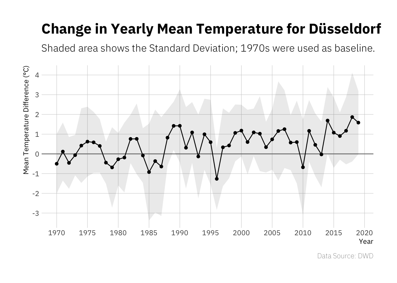
There appears to be a slight upwards trend, I guess this would be more striking if the data used here included a longer time frame. However of the last 10 years only one has been clearly below 0°C difference to the baseline period and six have been clearly above 1°C difference.
Next try to re-create one of those average temperature stripe plots that have been popular for some time.
ggplot(yearly_summary) +
   aes(x = year, fill = yearly_mean_offset, y = 1) +
   geom_tile() +
   scale_fill_gradient2(low = "blue", high = "orangered", mid = "white") +
   guides(fill = FALSE) +
   theme_void()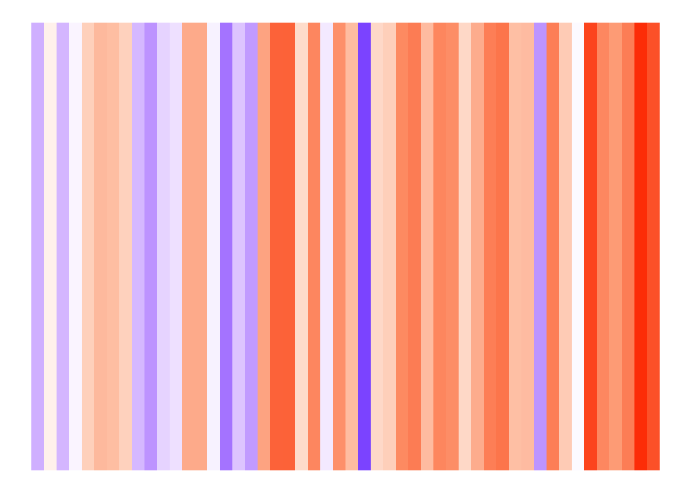
The reason these visualisations are rather popular is probably because they tend to be rather impressive. The right side of the plot (i.e. recent years) is pretty dominated by orange hues, indicating increased average temperatures.
Up next, try some more granular visualisations respecting months.
temp_mean %>%
  mutate(mn = factor(month.name[month], levels = month.name)) %>%
  ggplot() +
    aes(x = year, y = offset) +
    geom_hline(yintercept = 0, colour = "grey50") +
    geom_line() +
    geom_point() +
    scale_x_continuous(breaks = seq(1970, 2020, 5)) +
    scale_y_continuous(breaks = seq(-4, 4, 2)) +
    labs(x = "Year", y = "Mean Temperature Difference (°C)",
         title = "Changes in Mean Temperature for Düsseldorf",
         subtitle = paste("1970s were used as baseline."),
         caption = "Data Source: DWD") +
    facet_wrap(mn~., ncol = 2) +
    theme_minimal() +
    theme(panel.grid.minor = element_blank(),
          text = element_text(family = "IBM Plex Sans"),
          axis.text.x = element_text(angle = 90),
          panel.spacing.y = unit(0, "lines"))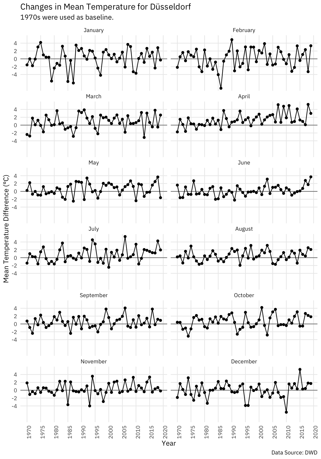
The data is obviously much more noisy than he data for entire years, but the overall trend appears to be the same. Looking at recent data we get a nice reminder that current weather conditions may not representative for the overall climate condition. June 2019 is at a striking +3.7°C compared to baseline, while May 2019 has been rather cold at -1.6°C compared to baseline. The data for the entire year is however at +1.6°C compared to baseline which fits in the overall trend and illustrates how too narrow ranges of data may not be representative.
Let’s try some tiles for the monthly data as well:
temp_mean %>%
  mutate(mn = factor(month.name[month], levels = rev(month.name))) %>%
  ggplot() +
    aes(x = year, y = mn, fill = offset) +
    geom_raster() +
    labs(y = NULL, x = NULL, caption = "Data Source: DWD", fill = "Offset °C",
         title = "Changes in Mean Temperature for Düsseldorf",
         subtitle = "1970s were used as baseline") +
    scale_fill_gradient2(low = "blue", high = "orangered", mid = "white") +
    hrbrthemes::theme_ipsum_ps() +
    theme(axis.text.x = element_blank(),
          panel.grid = element_blank())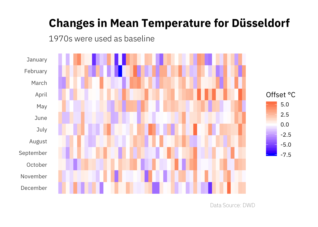
This visualisation is a bit hard to do (and a bit hard to read to be honest), as the amount of information in the plot is quite high and the monthly data is a bit noisy.
To finish things, let’s create a climate diagram showing average minimum and maximum as well as precipitation for 1970 to 2019 in five year intervals.
five_year_interval <- dclimate %>%
  mutate(year_grp = 5 * floor(year / 5)) %>%
  group_by(year_grp) %>%
  summarise(min = mean(tnk),
            max = mean(txk),
            rain = mean(rsk)) %>%
  ungroup()

five_year_interval
## # A tibble: 10 x 4
## year_grp min max rain
## <dbl> <dbl> <dbl> <dbl>
## 1 1970 6.14 14.2 2.00
## 2 1975 6.34 14.3 1.82
## 3 1980 6.63 14.4 2.27
## 4 1985 6.61 14.3 2.22
## 5 1990 7.14 15.0 2.10
## 6 1995 6.49 14.6 2.17
## 7 2000 6.90 15.4 2.14
## 8 2005 6.83 15.3 2.23
## 9 2010 6.36 15.0 1.95
## 10 2015 6.89 16.0 1.84We create separate plots showing the temperature data and the precipitation data
and then bind them together using the patchwork package.
temp_plot <- ggplot(five_year_interval) +
  aes(x = year_grp, ymin = min, ymax = max) +
  geom_linerange(size = 5, colour = "red") +
  geom_text(aes(y = min - 1, label = round(min, 1)), colour = "red",
            family = "IBM Plex Sans") +
  geom_text(aes(y = max + 1, label = round(max, 1)), colour = "red",
            family = "IBM Plex Sans") +
  scale_x_continuous(breaks = seq(1970, 2015, 5), labels = NULL) +
  expand_limits(y = c(2.5, 17.5)) +
  labs(y = "Temperature Min/Max °C", x = NULL) +
  hrbrthemes::theme_ipsum_ps()

# does include other types of precipitation as well, but should be mostly rain
rain_plot <- ggplot(five_year_interval) +
  aes(x = year_grp, ymin = 0, ymax = rain) +
  geom_linerange(size = 5, colour = "blue") +
  geom_text(aes(y = rain + 0.5, label = round(rain, 1)), colour = "blue",
            family = "IBM Plex Sans") +
  scale_x_continuous(breaks = seq(1970, 2015, 5)) +
  expand_limits(y = 3) +
  labs(y = "Precipitation mm", x = "Five-Year Interval") +
  hrbrthemes::theme_ipsum_ps() +
  theme(plot.margin = margin(-10, 0, 0, 0, unit = "pt"))

climate_plot <- temp_plot / rain_plot +
  plot_layout(heights = c(2, 1)) +
  plot_annotation(title = "Climate in Düsseldorf 1979-2019",
                  subtitle = "Shown are averages per five-year interval.",
                  theme = theme(text = element_text(family = "IBM Plex Sans"),
                                plot.title = element_text(face = "bold")))

climate_plot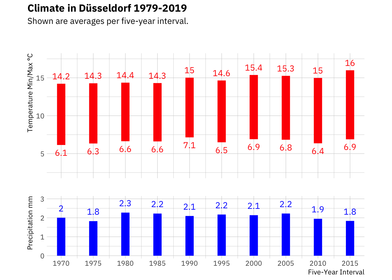
From this visualisation we can see that temperatures appear to be rising. While the last five years have been exceptionally warm, the trend is visible in the preceding data as well, mainly in the average maximum. The rain data however does not suggest a trend; although the last few years have been considered rather dry. As we are dealing with five year averages, the effect might not be masked.
Conclusions
Form exploring primarily temperature data for Düsseldorf, Germany, we can see that there appears to be a trend in temperatures over time from 1970 to today. Given all we know the effects we see would probably be much larger if we had data for a longer time frame available, e.g. if the data was available from 1900 onwards. When talking about climate change it is also important to note that single weather observations are not climate, but longer trends are.