Statistics, Science, Random Ramblings
A blog about data and other interesting things
Exploring the E-road network
Here, we will look at the network of Euro-Roads, which is an international system of numbering important roads throughout Europe. The marking of roads as Euro-Roads usually co-exists with national numberings and the visibility of the E-numbers varies by country.
The dataset was downloaded from KONECT. There is no licence information included so I won’t share the original data.
I had to apply one manual fix to the data: there are two major cities in Europe called Brest, one in Belarus and one in France. Unfortunately, they were merged together in the raw data, so I split them up into Brest_BY and Brest_FR.
Reading the data
set.seed(78987)
library("ggraph")
library("igraph")
library("tidygraph")
library("tidyverse")
There are two files containing the data. One for the nodes and one giving the edges. The edges are unweighed and undirected.
nodes <- read_table("ent.subelj_euroroad_euroroad.city.name",
                    col_names = "name")
nodes <- nodes %>% mutate(id = 1:nrow(nodes))
Have a quick glance at the data to verify that it looks as expected.
glimpse(nodes)## Rows: 1,175
## Columns: 2
## $ name <chr> "Greenock", "Glasgow", "Preston", "Birmingham", "Southampton", "…
## $ id <int> 1, 2, 3, 4, 5, 6, 7, 8, 9, 10, 11, 12, 13, 14, 15, 16, 17, 18, 1…Now proceed to the edges. The edge dataset starts with two rows that look like
comments (lines starting with a %), so those should be skipped.
edges <- read_delim("out.subelj_euroroad_euroroad",
                    skip = 2, col_names = c("from", "to"), delim = " ")
And also have a peek at the data.
glimpse(edges)## Rows: 1,417
## Columns: 2
## $ from <dbl> 1, 2, 2, 3, 4, 4, 6, 6, 7, 7, 7, 7, 7, 7, 7, 8, 8, 8, 8, 9, 9, 9…
## $ to <dbl> 2, 3, 17, 4, 5, 855, 7, 880, 8, 22, 23, 411, 453, 454, 889, 9, 4…Finally, we can put bot parts together to from a graph.
eroads <- tbl_graph(nodes, edges, directed = FALSE)Overview of the graph
Before characterising the graph with more depth we start by calculating some basic properties of it, so we get a a better understanding of the data we are dealing with.
First, order and size:
gsize(eroads)## [1] 1417gorder(eroads)## [1] 1175With the size not being that much larger than the order we can already conclude that the network must be somewhat sparse. This makes sense as we are dealing with a road network only involving major roads across the entirety of Europe and parts of Asia.
comp <- components(eroads)
comp$no
## [1] 26The amount of components is relatively large. There are both islands as well as potential e-roads not being directly connected to other e-roads, as even major roads are not present in the dataset if they are not part of the e-road network.
comp$csize## [1] 39 1040 3 4 8 5 2 15 3 4 5 4 4 2 2
## [16] 2 2 7 2 2 2 10 2 2 2 2Most nodes belong to one large component, with all other components being rather small in comparison.
Compared to what I have covered in a first tutorial there are more measures we can recruit when we want to characterise as a whole.
The first of these measures would be the diameter. The diameter is the amount of edges on the longest geodesic in the graph. Geodesic is essentially different way of saying shortest path. So, of all shortest paths between all the nodes in the network, we have a look at which of these paths is the longest.
diameter(eroads, directed = FALSE)## [1] 62We will have a closer look at this value later on.
Another interesting property is the edge density, sometimes also referred to as cost. We got a first hint at the sparsity of the network just from looking at the amount of nodes and edges present in the graph, but calculating the edge density gives us an exact value. This value describes the proportion of present edges compared to all possible edges in the graph (assuming single edges between nodes). A network with many edges is good at quickly transferring information between nodes (the exact interpretation of this of course depends on the kind of data your network represents), but at the same time it is costly (assuming that there is some sort of cost associated with establishing an edge). The opposite is of course true for networks with fewer edges: the network is cheap, but transfer of information becomes slower as one piece of information likely has to travel through more nodes and edges to reach its destination.
edge_density(eroads)## [1] 0.002054442We see a very low value here, indicating that only about 0.2% of possible edges are present, thus the network is definitely on the sparser side of things.
Finally, another whole-graph measure that is of interest is the average shortest path length. While the diameter above gave us the longest shortest path and the edge density gives us an idea of the sparsity of the network, we are likely interested in how long it takes on average to get from A to B in our graph. This is exactly what the average shortest path lengths tells us.
mean_distance(eroads, directed = FALSE, unconnected = TRUE)## [1] 19.37821Given some knowledge about the network we are dealing with here the results make a lot of sense. The diameter is large compared to the average shortest paths, as our network includes for example connections from Portugal to Kazakhstan. While there is no distance information in our network, it appears straightforward that such a connection would travel through many nodes and edges. However, in contrast especially for nodes in the central part of Europe it seems likely that there are a) many nodes and b) many connections between the nodes, making (graph) distances short. Finally, the relative sparsity of the network is easy to explain, as it seems unlikely that there are direct connections between nodes that are thousands of kilometres apart.
Obviously these are not the only measures you can calculate to characterise
a graph, so I suggest exploring what igraph and
tidygraph can do.
Centrality
Degree
There are different ways we can characterise centrality in a graph. Centrality in relation to graphs is essentially a characterisation of importance. The most straightforward way to characterise centrality (or importance) is the degree, which is the amount of connections a node has. The idea here being that nodes that have more connections to other nodes are more important than nodes with only few connections.
eroads <- eroads %>%
  activate("nodes") %>%
  mutate(degree = centrality_degree())
As we are dealing with a lot of data here it is probably useful to generate some descriptives. As we will apply this to a lot of measures we create a function.
basic_desc <- function(data, col) {
  data %>%
    activate("nodes") %>%
    as_tibble() %>%
    summarise(what = rlang::as_name(rlang::enquo(col)),
              mean = mean({{ col }}),
              median = median({{ col }}),
              sd = sd({{ col }}),
              se = sd({{ col }}) / sqrt(n()),
              min = min({{ col }}),
              max = max({{ col }}))
}
And we can apply it to get a quick overview.
basic_desc(eroads, degree)## # A tibble: 1 x 7
## what mean median sd se min max
## <chr> <dbl> <dbl> <dbl> <dbl> <dbl> <dbl>
## 1 degree 2.41 2 1.19 0.0347 1 10It seems like most nodes have a rather low degree. As most cities and towns in the data are just part of a single e-road passing through them, leading to a degree of two, this is in line with the data.
Plotting the distribution of the values is probably useful as well.
ggplot(eroads %>% activate("nodes") %>% as_tibble()) +
  geom_histogram(aes(x = degree), bins = 10,
                 fill = "turquoise4", colour = "white") +
  scale_x_continuous(breaks = seq(-1, 10, 1)) +
  scale_y_continuous(breaks = seq(0, 700, 100)) +
  labs(x = "Degree", y = "Count", title = "Nodal Degree") +
  hrbrthemes::theme_ipsum_ps()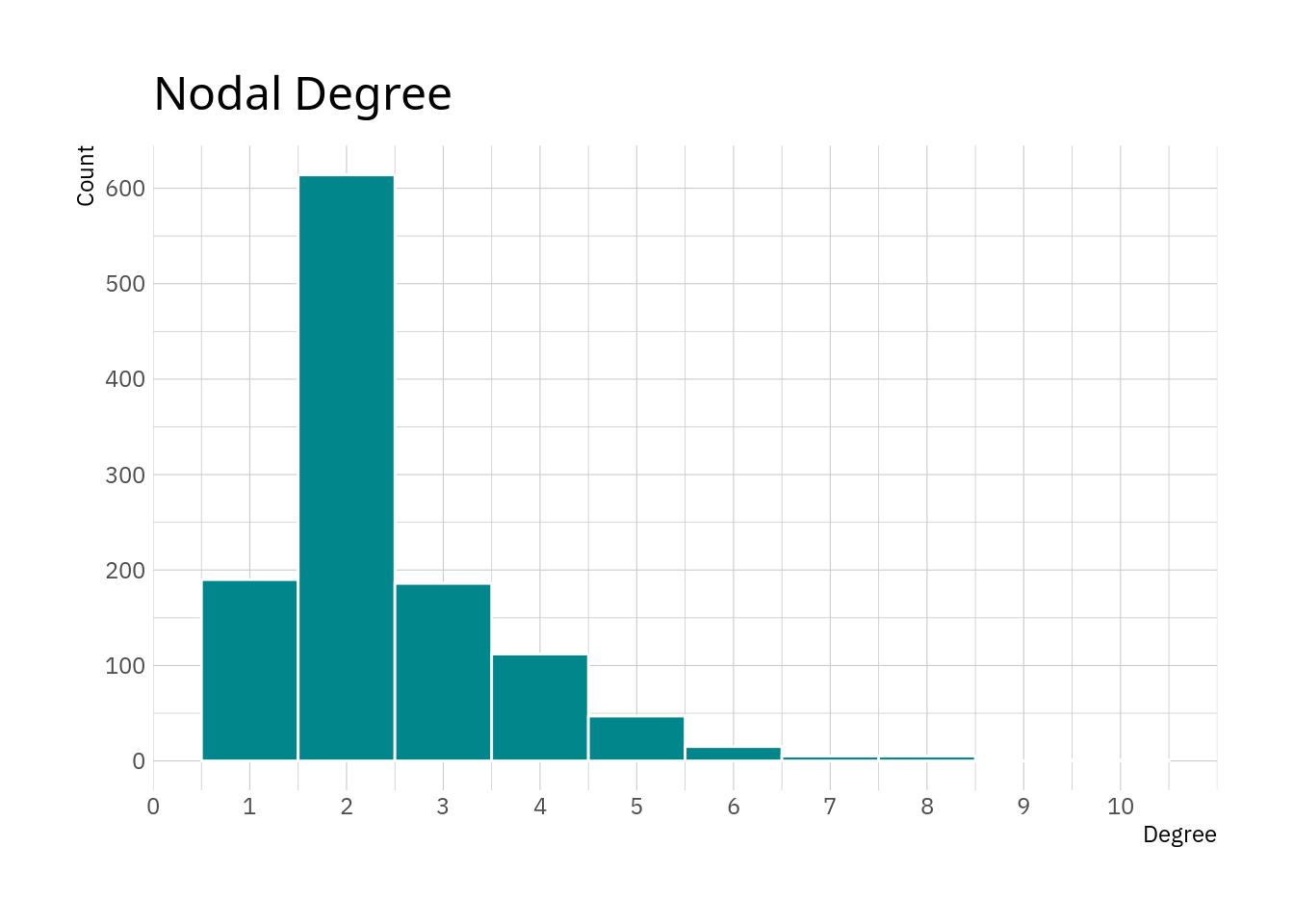
The plot essentially confirms what we see in the table above. The majority of nodes has a degree of 3 and smaller, with values of 6 and higher being really rare.
And we can get an overview of the nodes with the highest degree.
eroads %>%
  activate("nodes") %>%
  as_tibble() %>%
  select(name, degree) %>%
  slice_max(degree, n = 10)
## # A tibble: 11 x 2
## name degree
## <chr> <dbl>
## 1 Moscow 10
## 2 Paris 8
## 3 Liège 8
## 4 Munich 8
## 5 Berlin 8
## 6 Budapest 8
## 7 Metz 7
## 8 Prague 7
## 9 Bratislava 7
## 10 Warsaw 7
## 11 Vienna 7Most of the high-degree nodes are capital cities, except Liège, Metz and Munich. It is not too surprising that capitals seem to be better connected than less important cities. Moscow also happens to be the largest (most populated) city in Europe.
Betweenness
Betweenness centrality indicates how many shortest paths travel through a node. The higher this value is the more important the node is for the network.
For some measures, like betweenness, there is an option to output a normalised value. The obvious advantage of the normalised value is that it is easier to interpret in a broader sense and compare between networks, while the obvious disadvantage is that you can not directly interpret the value in terms of data.
eroads <- eroads %>%
  activate("nodes") %>%
  mutate(betweenness = centrality_betweenness(
    normalized = TRUE, directed = FALSE))

basic_desc(eroads, betweenness)
## # A tibble: 1 x 7
## what mean median sd se min max
## <chr> <dbl> <dbl> <dbl> <dbl> <dbl> <dbl>
## 1 betweenness 0.0123 0.00254 0.0275 0.000803 0 0.261While the data is normalised, the mean and median are pointing towards most nodes having rather low betweenness values.
ggplot(eroads %>% activate("nodes") %>% as_tibble()) +
  geom_histogram(aes(x = betweenness), bins = 25,
                 fill = "turquoise4", colour = "white") +
  scale_x_continuous(breaks = seq(0, 0.25, 0.05),
                     minor_breaks = seq(0, 0.25, 0.01)) +
  scale_y_continuous(breaks = seq(0, 700, 100)) +
  labs(x = "Betweenness", y = "Count",
       title = "Betweenness Centrality") +
  hrbrthemes::theme_ipsum_ps()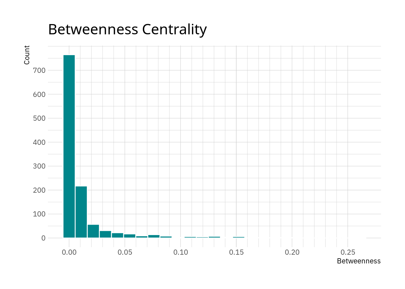
As thought, most nodes have relatively low values with only a few nodes exhibiting large values here.
And again, a look at the nodes with the largest values can generate some insight.
eroads %>%
  activate("nodes") %>%
  as_tibble() %>%
  select(name, betweenness) %>%
  slice_max(betweenness, n = 10)
## # A tibble: 10 x 2
## name betweenness
## <chr> <dbl>
## 1 Warsaw 0.261
## 2 Saint Petersburg 0.195
## 3 Berlin 0.191
## 4 Poznań 0.181
## 5 Świebodzin 0.176
## 6 Hamburg 0.169
## 7 Vyborg 0.154
## 8 Vaalimaa 0.153
## 9 Pskov 0.152
## 10 Kotka 0.152We can see the values quickly decreasing. We also see that the cities here seem to be in a corridor including north-east Germany, Poland, southern Finland and north-western Russia. Given that higher betweenness means that more shortest paths travel through a node, this could suggest that this region acts as sort of an hub in between more remote parts of the network.
Local transitivity
Local transitivity, also known as local clustering, gives the amount edges between the neighbours of a node in relation to to maximum possible amount of edges between these notes. So, it is essentially the cost, but for a single node’s neighbourhood. The larger this value is for a node the better its neighbourhood is connected.
eroads <- eroads %>%
  activate("nodes") %>%
  mutate(transitivity = local_transitivity())

basic_desc(eroads, transitivity)
## # A tibble: 1 x 7
## what mean median sd se min max
## <chr> <dbl> <dbl> <dbl> <dbl> <dbl> <dbl>
## 1 transitivity 0.0167 0 0.0836 0.00244 0 1The descriptives show that for most nodes the local transitivity is rather low. Again, we are dealing with a network including only the most major of roads in Europe, so it is perhaps unlikely to have dense networks of these roads in most places.
ggplot(eroads %>% activate("nodes") %>% as_tibble()) +
  geom_histogram(aes(x = transitivity), bins = 20,
                 fill = "turquoise4", colour = "white") +
  scale_x_continuous(breaks = seq(0, 1, 0.1),
                     minor_breaks = seq(0, 1, 0.05)) +
  scale_y_log10() +
  labs(x = "Transitivity", y = "Count",
       title = "Local Transitivity") +
  hrbrthemes::theme_ipsum_ps()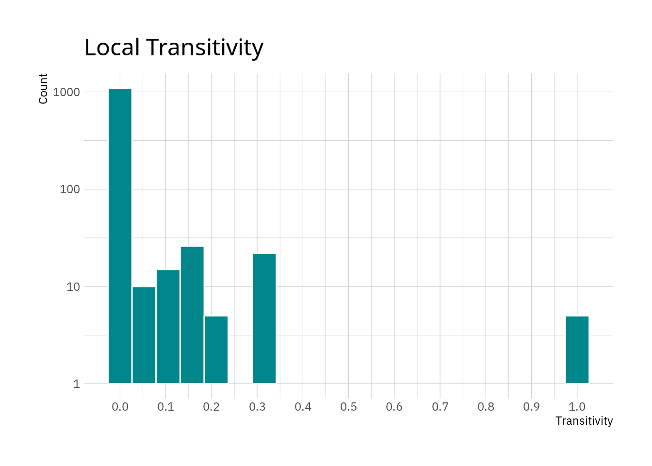
The plot confirms the thought that most nodes appear to have relatively small local transitivity values. The small peak at 1 are nodes where all neighbours are connected between each other. Note that this does not include any information about the amount of neighbours, only whether they are connected among each other. However reaching a value of 1 for local transitivity if there are numerous neighbours requires a lot more edges than if there are only two or three neighbours for a node.
Looking at the nodes with the highest values might be interesting as well.
eroads %>%
  activate("nodes") %>%
  as_tibble() %>%
  select(name, transitivity) %>%
  slice_max(transitivity, n = 10)
## # A tibble: 27 x 2
## name transitivity
## <chr> <dbl>
## 1 Brindisi 1
## 2 Domokos 1
## 3 Vyšné Nemecké 1
## 4 Postojna 1
## 5 Spielfeld 1
## 6 Lausanne 0.333
## 7 Naples 0.333
## 8 Salerno 0.333
## 9 Bari 0.333
## 10 Jihlava 0.333
## # … with 17 more rowsHowever, I can not really see a pattern here. The places in the list are not exactly major cities, it might just be that they are in an area where e-roads cross. It might be a good idea to visualise that.
Further centrality measures
Obviously you are not just limited to calculating three centrality measures on
your graph. Looking at the
help page for centrality of
the tidygraph measure shows that there are potentially a lot more measures
that might be of interest.
Visualisations
Let’s create visualisations of the network.
For plotting graphs the ggraph library is a handy tool which is rather
straightforward to use if you have experience with ggplot2.
The simplest call can do to visualise the networks is relatively short.
ggraph(eroads, layout = "auto") +
  geom_edge_link() +
  geom_node_point() +
  theme_graph()
## Using `stress` as default layout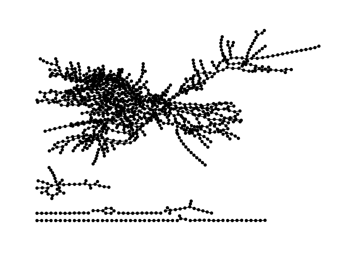
That’s a bit ugly, but at least we now have a visualisation of our network. But we can do better.
Given that we are dealing with geodata we can build a helper function to interact with a geo API to fetch coordinates. Fast-forward of searching a straightforward geo API and cleaning the data quite a bit we can visualise the network in a more natural way.
coordinates <- read_delim("coordinates.tsv", delim = "\t")
coordinates
## # A tibble: 1,175 x 4
## place lon lat id
## <chr> <dbl> <dbl> <dbl>
## 1 Greenock -4.76 55.9 1
## 2 Glasgow -4.25 55.9 2
## 3 Preston -2.70 53.8 3
## 4 Birmingham -1.90 52.5 4
## 5 Southampton -1.40 50.9 5
## 6 Le Havre 0.1 49.5 6
## 7 Paris 2.35 48.9 7
## 8 Orléans 1.91 47.9 8
## 9 Bordeaux -0.580 44.8 9
## 10 San Sebastián -1.98 43.3 10
## # … with 1,165 more rowsWe have names, node IDs and coordinates in this data set. So, this can now be joined with the node data.
eroads <- eroads %>% left_join(coordinates, by = "id")Plotting with custom x and y coordinates is fortunately very straightforward
with ggraph.
ggraph(eroads, x = lon, y = lat)  +
  geom_edge_link() +
  geom_node_point() +
  theme_graph() +
  coord_map(projection = "albers", lat0 = 40, lat1 = 65) +
  theme(plot.margin = margin(0, 0, 0, 0, "cm"))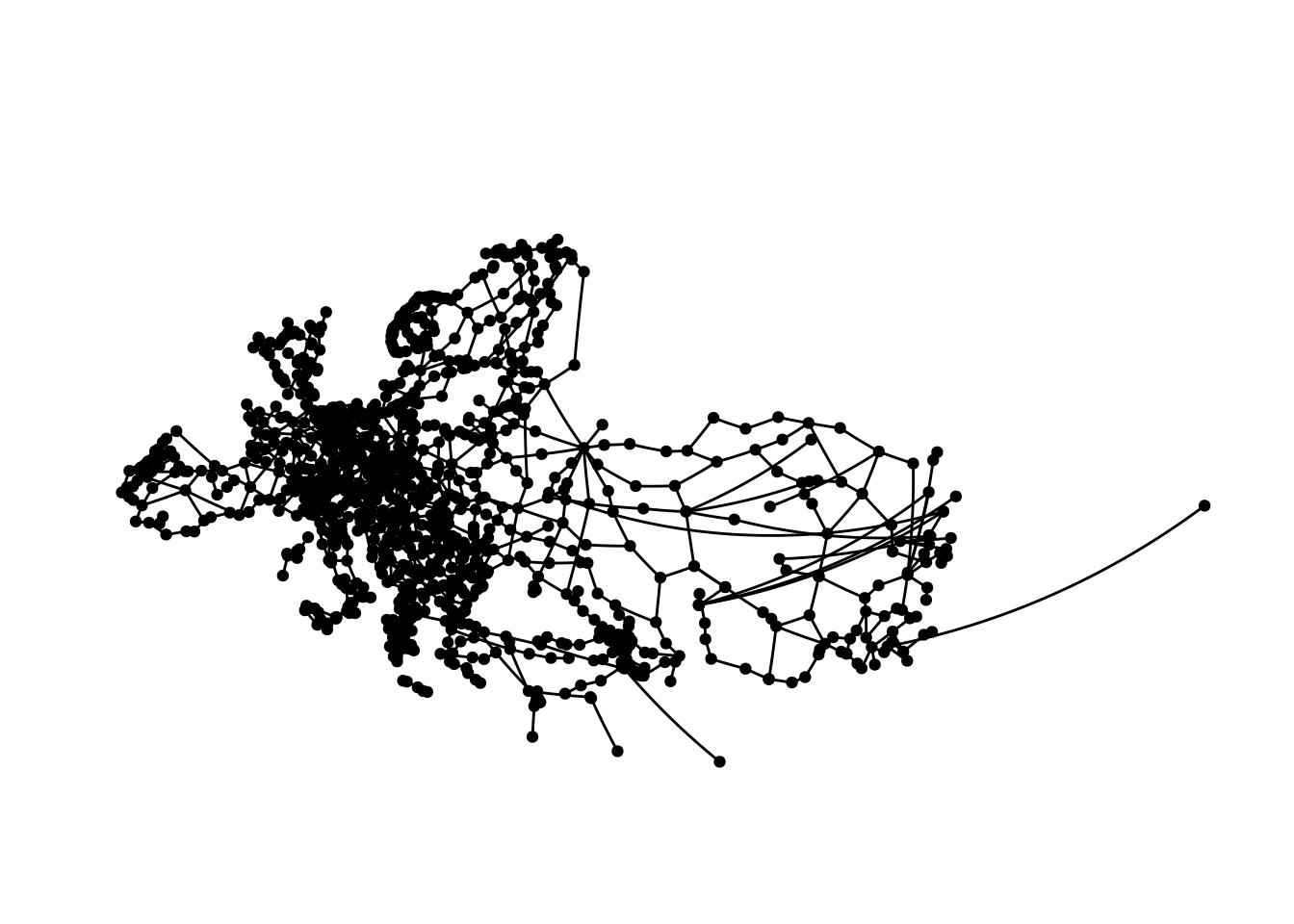
Which pretty closely resembles Europe and parts of central Asia. Plotting this is kind of hard, especially with limited space, as we cover a really large area here.
While I did clean the data and tried to ensure everything is correct, there are most likely some coordinates in the data that are off to some extent skewing the map a bit.
The longest geodesic
At the beginning we found the diameter of the graph to be
62. Now, we are interested in finding and visualising the
longest shortest path in the graph. As far as I can see there is no function
in tidygraph or igraph to do this, but this is not too complex.
There is shortest_path in igraph, which gives the shortest paths from a
specified node to all other nodes of the graph. This means we can apply this
to all nodes and find the longest shortest path for each node and then
subsequently the longest of the longest shortest paths.
With 1175 nodes this does take a minute or two, though.
node_num <- seq_along(nodes$name)
shortest_path_lengths <- sapply(node_num[-length(node_num)], function(x) {
  # uncomment the next line to get an indication of progress
  # cat(paste(x, "/", length(node_num), "\r"))
  max(sapply(shortest_paths(
      eroads, from = x, to = node_num[-1:-x])$vpath, length))
})
We now have a vector where each value is the length of the longest shortest path for a node. The order of the values corresponds to the id of the nodes in the graph.
head(shortest_path_lengths)## [1] 15 14 15 15 16 50Thus it is straightforward to find which nodes have the maximum path length.
dm <- diameter(eroads) + 1
nodes$name[shortest_path_lengths == dm]
## [1] "Rennesøy"We need to add 1 to the diameter here, because the length we generated is based on the amount of nodes in the path.
Now we can extract the path (in fact there are two paths of length 62).
longest_shortest_paths <- shortest_paths(
    eroads, from = nodes$name[shortest_path_lengths == dm])
longest_paths <- longest_shortest_paths$vpath[
    lengths(longest_shortest_paths$vpath) == dm]
longest_paths
## [[1]]
## + 63/1175 vertices, named, from f4e7667:
## [1] Rennesøy Randaberg Stavanger Sandnes
## [5] Helleland Flekkefjord Lyngdal Mandal
## [9] Kristiansand Arendal Porsgrunn Larvik
## [13] Sandefjord Horten Drammen Oslo
## [17] Gothenburg Säffle Mora Östersund
## [21] Sundsvall Örnsköldsvik Umeå Luleå
## [25] Haparanda Tornio Kemi Oulu
## [29] Jyväskylä Heinola Lahti Helsinki
## [33] Kotka Vaalimaa Vyborg Saint Petersburg
## [37] Pskov Riga Kaunas Warsaw
## + ... omitted several vertices
##
## [[2]]
## + 63/1175 vertices, named, from f4e7667:
## [1] Rennesøy Randaberg Stavanger
## [4] Sandnes Helleland Flekkefjord
## [7] Lyngdal Mandal Kristiansand
## [10] Arendal Porsgrunn Larvik
## [13] Sandefjord Horten Drammen
## [16] Oslo Gothenburg Säffle
## [19] Mora Östersund Sundsvall
## [22] Örnsköldsvik Umeå Luleå
## [25] Haparanda Tornio Kemi
## [28] Oulu Jyväskylä Heinola
## + ... omitted several verticesAnd now we have everything we need to generate visualisations of the two longest geodesics in the graph.
visualise_path <- function(data, from, to) {
  data <- data %>%
    morph(to_shortest_path, from = from, to = to) %>%
    activate("edges") %>%
    mutate(shortest = "1") %>%
    unmorph()

  data %>%
    ggraph(x = lon, y = lat)  +
      geom_edge_link(aes(edge_colour = shortest, edge_width = shortest)) +
      scale_edge_width_discrete(na.value = 0.5) +
      geom_node_point(alpha = .3) +
      theme_graph() +
      guides(edge_colour = FALSE, edge_width = FALSE) +
      coord_map(projection = "albers", lat0 = 40, lat1 = 65) +
      theme(plot.margin = margin(0, 0, 0, 0, "cm"))
}

visualise_path(eroads, longest_paths[[1]][1], longest_paths[[1]][dm])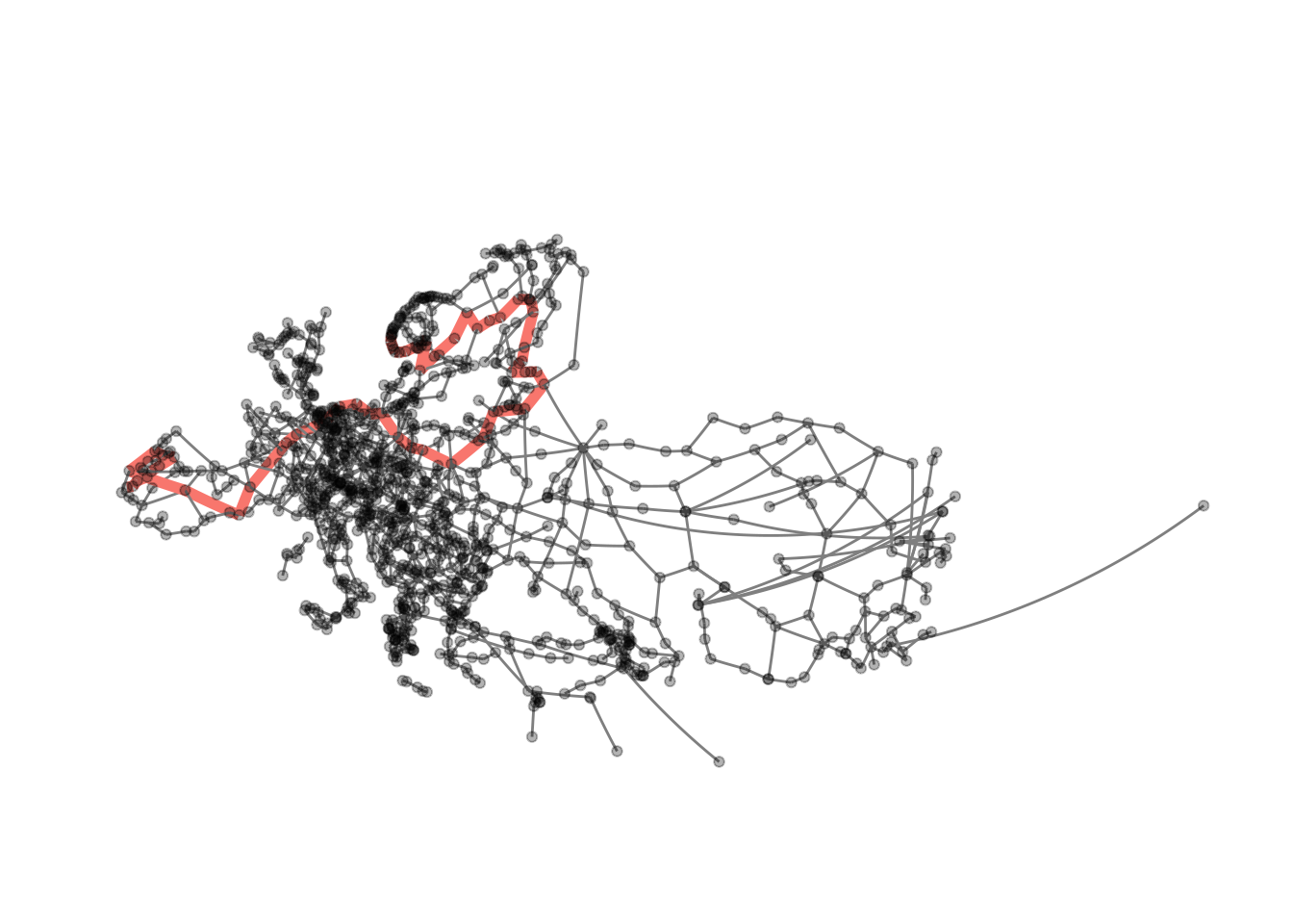
visualise_path(eroads, longest_paths[[2]][1], longest_paths[[2]][dm])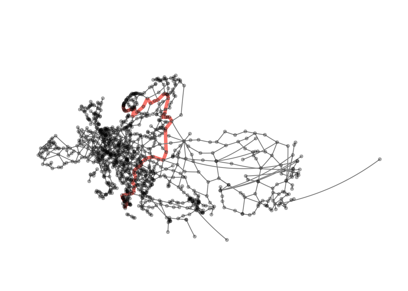
This does work with any other path in the graph as well, providing us with some rudimentary navigation. The only downside with our current implementation is that we need to give node ids to the function, not names.
get_id <- function(data, place) {
  data %>%
    activate("nodes") %>%
    filter(name == {{ place }}) %>%
    select(id) %>%
    as_tibble() %>%
    deframe()
}
id_helsinki <- get_id(eroads, "Helsinki")
id_ljubljana <- get_id(eroads, "Ljubljana")
visualise_path(eroads, id_helsinki, id_ljubljana)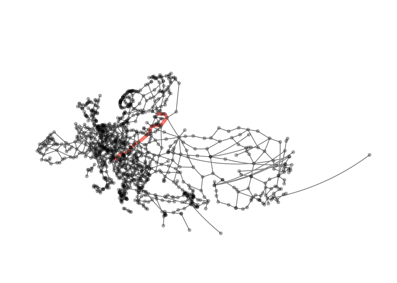
Centrality
Of course we can also easily visualise the centrality measures we calculated above. As this is a rather repetitive endeavour I will just do this for local transitivity.
ggraph(eroads, x = lon, y = lat) +
geom_edge_link() +
geom_node_point(aes(colour = transitivity, alpha = transitivity)) +
scale_colour_gradient(low = "grey30", high = "orangered") +
scale_alpha_continuous(range = c(0.2, 1)) +
guides(alpha = FALSE) +
theme_graph() +
coord_map(projection = "albers", lat0 = 40, lat1 = 65) +
theme(plot.margin = margin(0, 0, 0, 0, "cm"))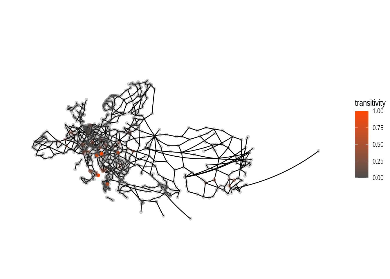 Compared to the tabular data we did have further above, we are able to see
some extent of local focus for nodes with high values for local transitivity.
By changing both alpha and colour dependent on the nodes’ transitivity
values the plot allows us to clearly see the location of the nodes with
high values.
If all nodes had the same alpha the visibility of the orange coloured nodes
would be quite bad.
Compared to the tabular data we did have further above, we are able to see
some extent of local focus for nodes with high values for local transitivity.
By changing both alpha and colour dependent on the nodes’ transitivity
values the plot allows us to clearly see the location of the nodes with
high values.
If all nodes had the same alpha the visibility of the orange coloured nodes
would be quite bad.
Community Detection
When dealing with graphs you might be interested in doing community detection
(also called clustering). As the name suggests this means finding nodes that
on some measure are closer to each other than to other nodes in the graph.
There is a large number of algorithms available both in the literature and in
the R packages we work with. One of the igraph main developers did post a
summary of algorithms available in the package some time ago on
stackoverflow. This answer is definitely
worth reading.
Different methods for community detection can lead to very different results in clustering.
Let’s visualise these differences. We start by applying the infomap algorithm to our data and colour nodes by group membership.
eroads <- eroads %>%
  activate("nodes") %>%
  mutate(infomap = group_infomap())

ggraph(eroads, x = lon, y = lat)  +
  geom_edge_link() +
  geom_node_point(aes(colour = as.factor(infomap)), alpha = .9) +
  theme_graph() +
  guides(colour = FALSE) +
  coord_map(projection = "albers", lat0 = 40, lat1 = 65) +
theme(plot.margin = margin(0, 0, 0, 0, "cm")) 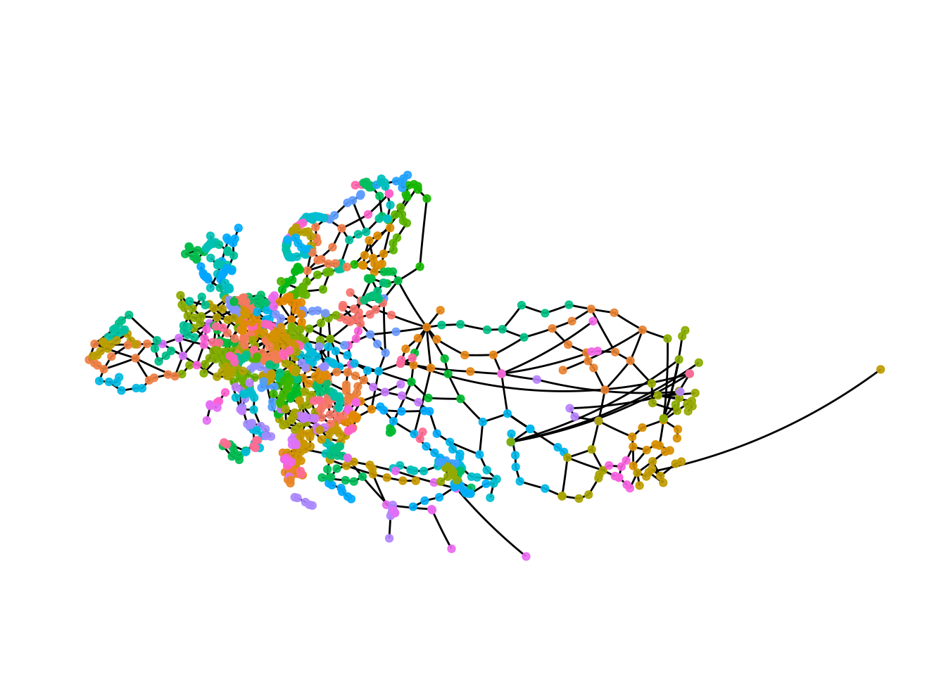
The plot gives a first impression, but there are too many groups to see anything.
One approach could be to just generate lists of cluster membership.
infomap_groups <- eroads %>%
  activate("nodes") %>%
  as_tibble() %>%
  group_by(infomap) %>%
  group_split()
Note, that we need to call as_tibble, to turn the nodes data into a tibble
as group_split is not available in tidygraph and dplyr can not deal with
tbl_graph objects.
infomap_groups[[1]] %>%
  select(name, lon, lat)
## # A tibble: 16 x 3
## name lon lat
## <chr> <dbl> <dbl>
## 1 Klaipėda 21.1 55.7
## 2 Kaunas 23.9 54.9
## 3 Vilnius 25.3 54.7
## 4 Riga 24.1 56.9
## 5 Šiauliai 23.3 55.9
## 6 Tolpaki 21.3 54.6
## 7 Ventspils 21.6 57.4
## 8 Rēzekne 27.3 56.5
## 9 Velikiye Luki 30.5 56.3
## 10 Nesterov 22.6 54.6
## 11 Marijampolė 23.4 54.6
## 12 Ukmergė 24.8 55.2
## 13 Daugavpils 26.5 55.9
## 14 Ostrov 28.4 57.3
## 15 Palanga 21.1 55.9
## 16 Panevėžys 24.4 55.7It looks like the cluster is somewhat regionally constrained. Even if you do not know anything about the places in the list the coordinates provide a nice clue.
We might want to visualise this.
eroads %>%
  activate("nodes") %>%
  mutate(cluster1 = ifelse(infomap == 1, infomap, NA)) %>%
  ggraph(x = lon, y = lat) +
    geom_edge_link(colour = "grey50") +
    geom_node_point(aes(colour = as.factor(cluster1)), alpha = .9) +
    theme_graph() +
    scale_colour_discrete(na.value = "grey40") +
    guides(colour = FALSE) +
    coord_map(projection = "albers", lat0 = 40, lat1 = 65) +
    theme(plot.margin = margin(0, 0, 0, 0, "cm"))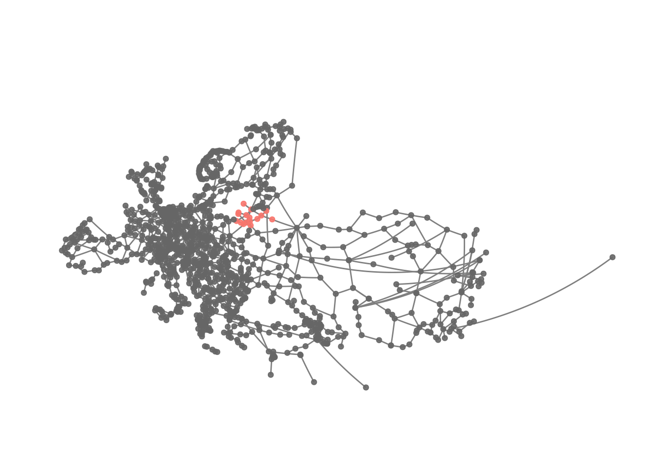
This kind of confirms the idea about the cluster’s location.
Obviously we can extend this solution.
eroads %>%
  activate("nodes") %>%
  mutate(cluster1 = ifelse(infomap %in% 1:10, infomap, NA)) %>%
  ggraph(x = lon, y = lat) +
    geom_edge_link(colour = "grey50") +
    geom_node_point(aes(colour = as.factor(cluster1)), alpha = .9) +
    theme_graph() +
    scale_colour_discrete(na.value = "grey40") +
    guides(colour = FALSE) +
    coord_map(projection = "albers", lat0 = 40, lat1 = 65) +
    theme(plot.margin = margin(0, 0, 0, 0, "cm"))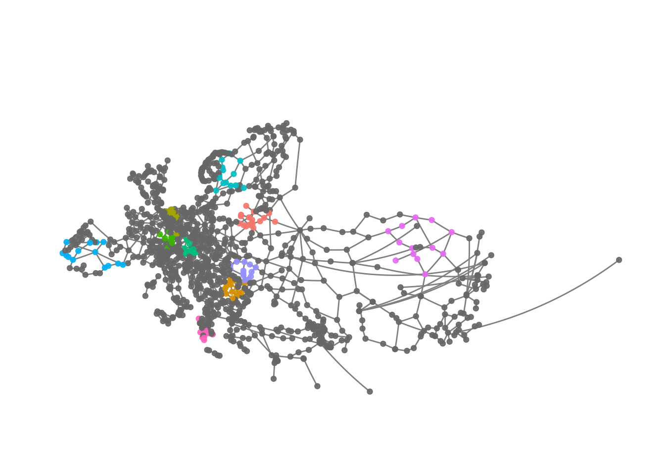
We can see that the clusters - at least those we plotted here - are somewhat regionally constrained.
Finally, we are probably interested in how many members each cluster has.
infomap_groups %>% map_int(nrow) ## [1] 16 16 15 15 14 14 14 14 13 13 12 12 12 12 12 12 12 12 11 11 11 11 11 11 11
## [26] 11 11 11 10 10 10 10 10 10 10 10 10 10 10 10 10 9 9 9 9 9 9 9 9 9
## [51] 9 9 9 9 9 8 8 8 8 8 8 8 8 8 8 8 8 8 8 8 7 7 7 7 7
## [76] 7 7 7 7 7 7 7 7 7 7 7 7 7 7 7 7 6 6 6 6 6 6 6 6 6
## [101] 6 6 6 6 6 6 6 6 6 6 6 6 6 6 5 5 5 5 5 5 5 5 5 5 4
## [126] 4 4 4 4 4 4 4 4 4 4 4 4 4 4 3 3 3 3 3 3 3 3 3 3 2
## [151] 2 2 2 2 2 2 2 2 2 2 2This looks like most of the clusters are kind of small and mostly similar in size. The idea that regionally nodes are better connected among each other compared to nodes father away, does not sound too far fetched, so there is nothing too surprising here.
We can apply a different grouping algorithm as well to see whether this leads to a different result.
eroads <- eroads %>%
  activate("nodes") %>%
  mutate(greedy = group_fast_greedy())

ggraph(eroads, x = lon, y = lat)  +
  geom_edge_link() +
  geom_node_point(aes(colour = as.factor(greedy)), alpha = .9) +
  theme_graph() +
  guides(colour = FALSE) +
  coord_map(projection = "albers", lat0 = 40, lat1 = 65) +
  theme(plot.margin = margin(0, 0, 0, 0, "cm"))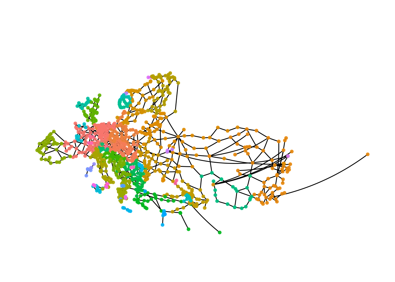
The result with the fast and greedy algorithm is very different than the result we got with the infomap algorithm. This is not unexpected, as with most kinds of data using different clustering algorithms will leads to different results, so in addition to thinking carefully about what kind of result you want there is probably also some trial and error involved.
Let’s have a closer look.
greedy_groups <- eroads %>%
  activate("nodes") %>%
  as_tibble() %>%
  group_by(greedy) %>%
  group_split()
We can get a quick overview of the cluster sizes.
greedy_groups %>% map_int(nrow)## [1] 127 78 73 71 70 61 57 52 52 50 47 41 39 39 37 32 32 32 28
## [20] 22 20 15 11 10 8 8 7 5 5 4 4 4 4 3 3 2 2 2
## [39] 2 2 2 2 2 2 2 2 2The groups are much larger here compared to what we got with infomap.
eroads %>%
  activate("nodes") %>%
  mutate(cluster1 = ifelse(greedy == 1, greedy, NA)) %>%
  ggraph(x = lon, y = lat) +
    geom_edge_link(colour = "grey50") +
    geom_node_point(aes(colour = as.factor(cluster1)), alpha = .9) +
    theme_graph() +
    scale_colour_discrete(na.value = "grey40") +
    guides(colour = FALSE) +
    coord_map(projection = "albers", lat0 = 40, lat1 = 65) +
    theme(plot.margin = margin(0, 0, 0, 0, "cm"))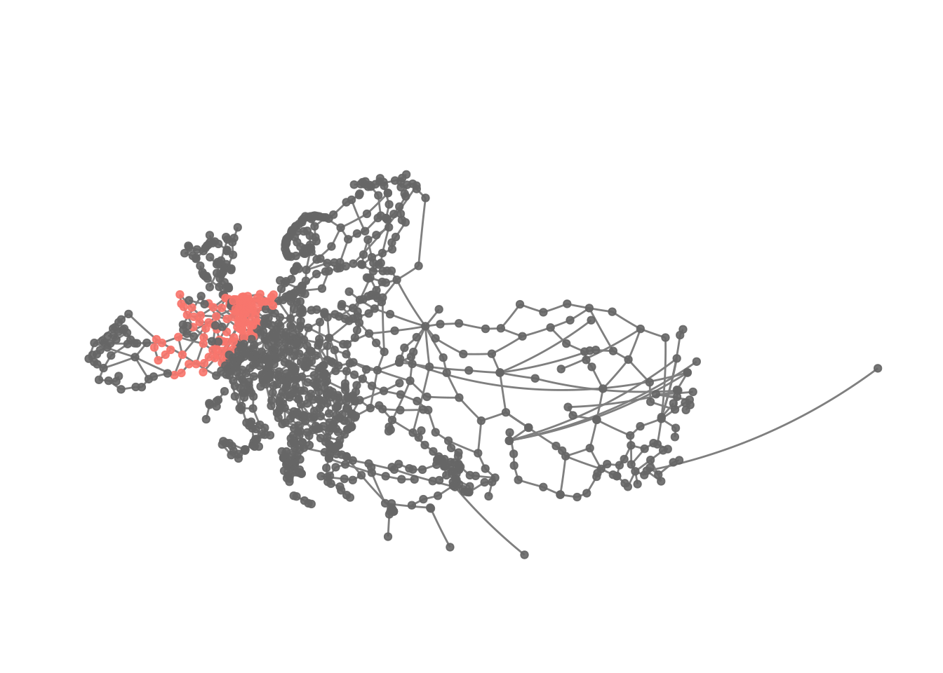
Apparently the first cluster here is one focusing on France and adjacent regions. Thus, it looks like while clusters appear to be regionally constrained as well, they tend to be larger using the fast and greedy algorithm.
Concluding remarks
Here, we have peeked further into network analysis compared to the first and very basic tutorial I wrote. Depending on what kind of data you are dealing with you might want to take a deep dive into this topic as I have still only scratched the surface.